Bullet charts are a variation of a bar chart developed by Stephen Few as a replacement for gauges and meters.
The Bullet chart has the following advantages over the gauges.
- Space saver – require less real estate, can be oriented horizontally and vertically based on the space available.
- Display multiple measures
- Easier to read and more informative
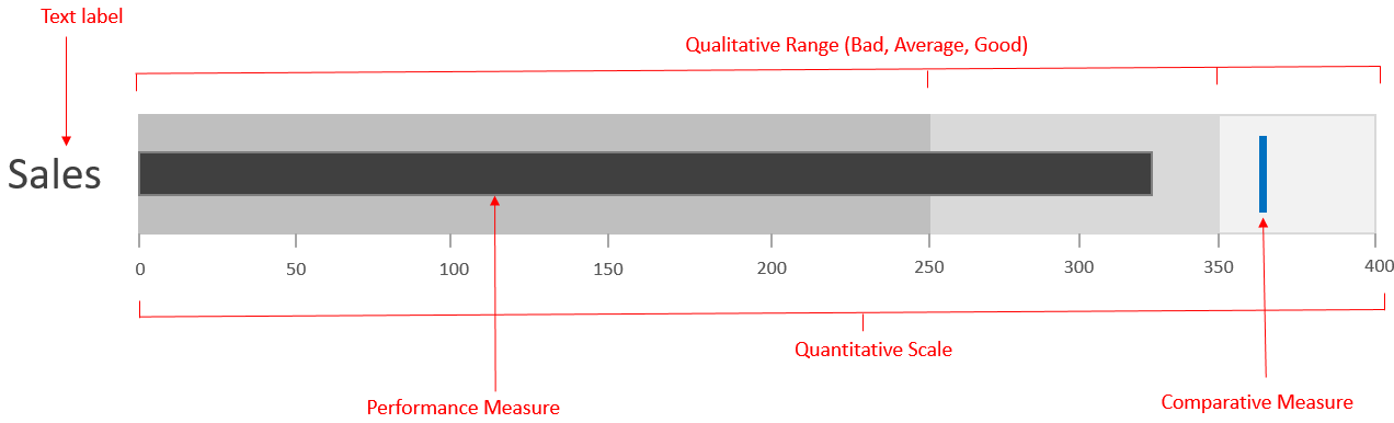
The bullet graph consists of five primary components:
- Performance Measure – The actual value of the metrics
- Comparative Measures – One or two comparative/ target measures to compare the performance of the metrics against a give target value
- Qualitative scale – To measure the metrics state i.e. good, bad or satisfactory
- Quantitative scale – Linear X axis to measure the value of the metrics
- Text label – For labeling the metric
Information can be shown in multiple formats using Bullet charts. Let’s look at some of the commonly used scenarios:
1. Highlighting performance against benchmark using conditional formatting
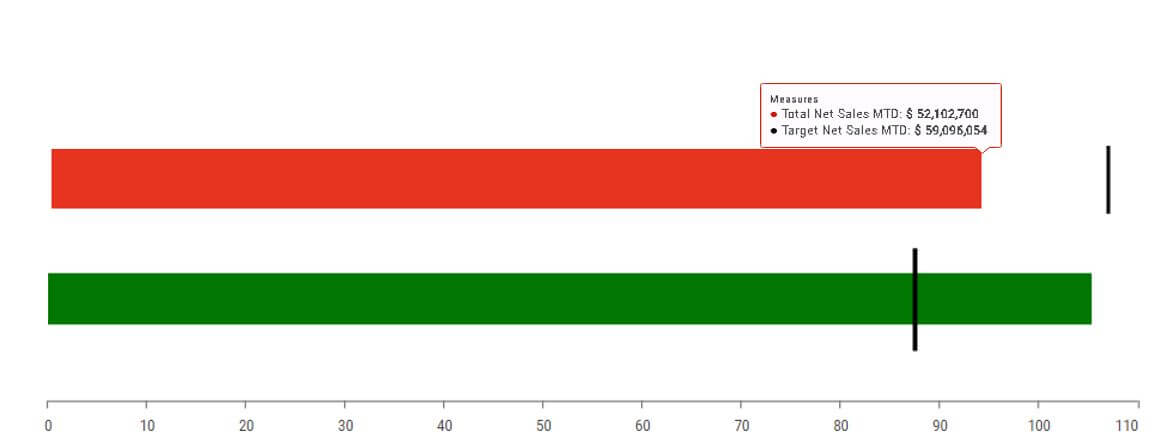
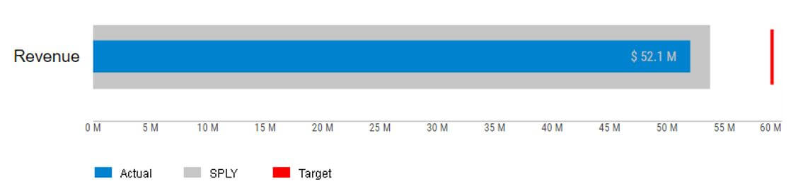
Actual Vs Target Value
Example: A Retail company, trying to view their Sales for this quarter. With the help of a bullet chart one can easily visualize sales progress by comparing the Actual sales vs Target.
Note that the red color quickly highlights the fact that the Target for this quarter has been missed.
2. Performance against 2 benchmarks
Actual Vs Target Vs Previous period
Example: A bullet chart could be used for Revenue Analysis where the Actual revenue could be compared with the Target and previous period revenue. This also helps in looking at the target value relative to last year which makes it more powerful.
3. Performance against 3 benchmarks
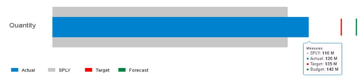
Actual, Same period last year (SPLY) vs Plan and Forecast
Example: A manufacturing company trying to analyze order quantity of the product by comparing Actual quantity to Same period last year, Target and Forecasted value. This would help in demand planning forecast numbers leading to better sales planning.
4. Vertical Bullet chart using Qualitative scale (Good Bad Ugly)
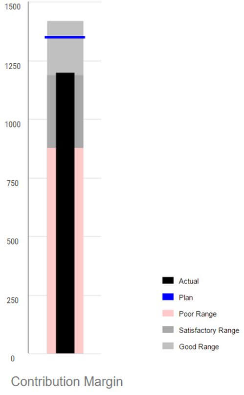
In certain cases, the vertical orientation of the Bullet chart seems more beneficial than horizontal based on the real estate available. The qualitative scale not helps to visualizes the target achievement: poor, satisfactory and good but also the degree to which it resides within that state. The qualitative scaled could be configured in the following ways:
Example: Using the qualitative range one could easily spot the contribution margin lying in the good range (1290). Another example could be when percentages are involved with the target being 100% for example.
5. Negative scale
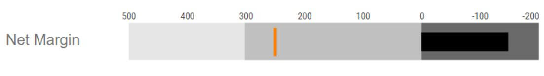
In certain situations, a bullet chart needs to represent both positive and negative values. For example, in the above case the Actual net margin is negative as compared to its target value.
* * *
Looking to try out bullet charts (It’s one component that you won’t find in Microsoft Excel)? VBX for SAP Design Studio offers bullet charts as part of an extensive library of 100+ components. Try it out today for free.