Location Analytics or Location Intelligence or perhaps simply put – the ability to put data on a map or show data as part of a physical location like a store – becomes more and more a very hot topic in our customer base. Part of our extensions for SAP BusinessObjects Design Studio is the ability to integrate maps into your dashboards and I would like to show you , how easy this can be done. Using our extensions, you have the option to integrate regional maps (see Figure 1) and maps down to a street level (see Figure 2).
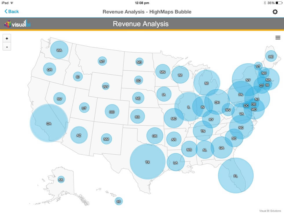
Figure 1 shows a US map with state details and revenue data per state shown in form of a bubble and the size of the bubble indicating the revenue amount.
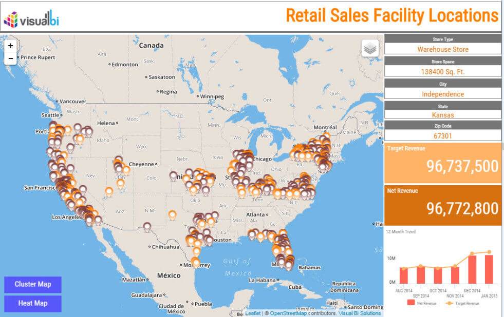
Figure 2 shows a list of retail locations shown in form of markers on the map with the ability to select each of the locations and list further details on the right hand side.
So how easy (or how difficult) is it to integrate such mapping information into SAP BusinessObjects Design Studio ?
Lets start with the first example where we visualize our world wide sales information onto a map with the option to drill down from the different countries to the next level of details.
In SAP BusinessObjects Design Studio I created a new project with a data source as shown in Figure 3.
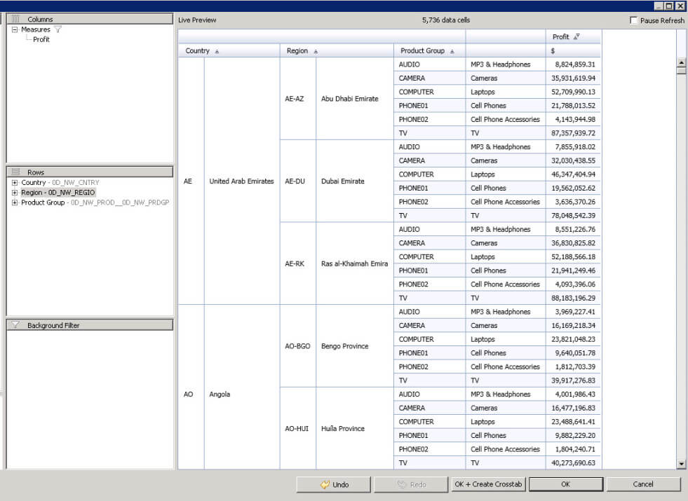
As you can see we have a dimension Country, dimension Region, dimension Product Group, and a measure Profit.
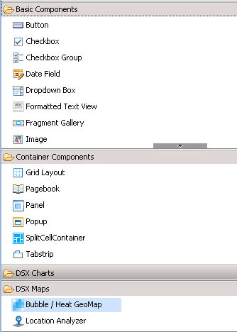
From the DSX (Design Studio EXtensions) Maps category we are going to use the Bubble / Heat GeoMap component and add it to our empty dashboard area. After we assigned the data source to our map component we can now configure the additional properties.
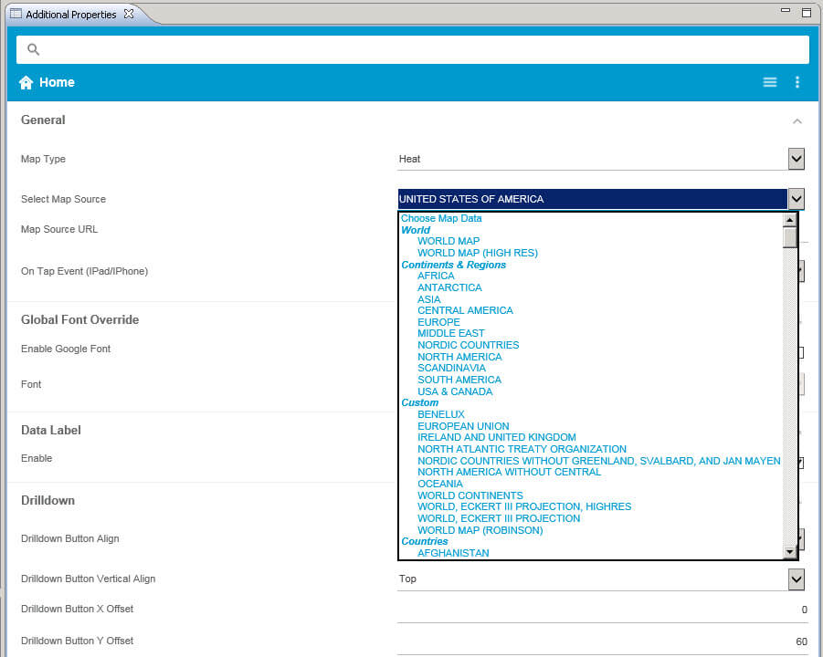
Our first step is to define which map we would like to use as a starting point. Right now our component is offering more than 300 maps out of the box with different level of granularity, such as a World map as the largest map, down to a district level in Germany. For our example we will use the World as a starting point and will then enable the drill down into the different countries for further details.
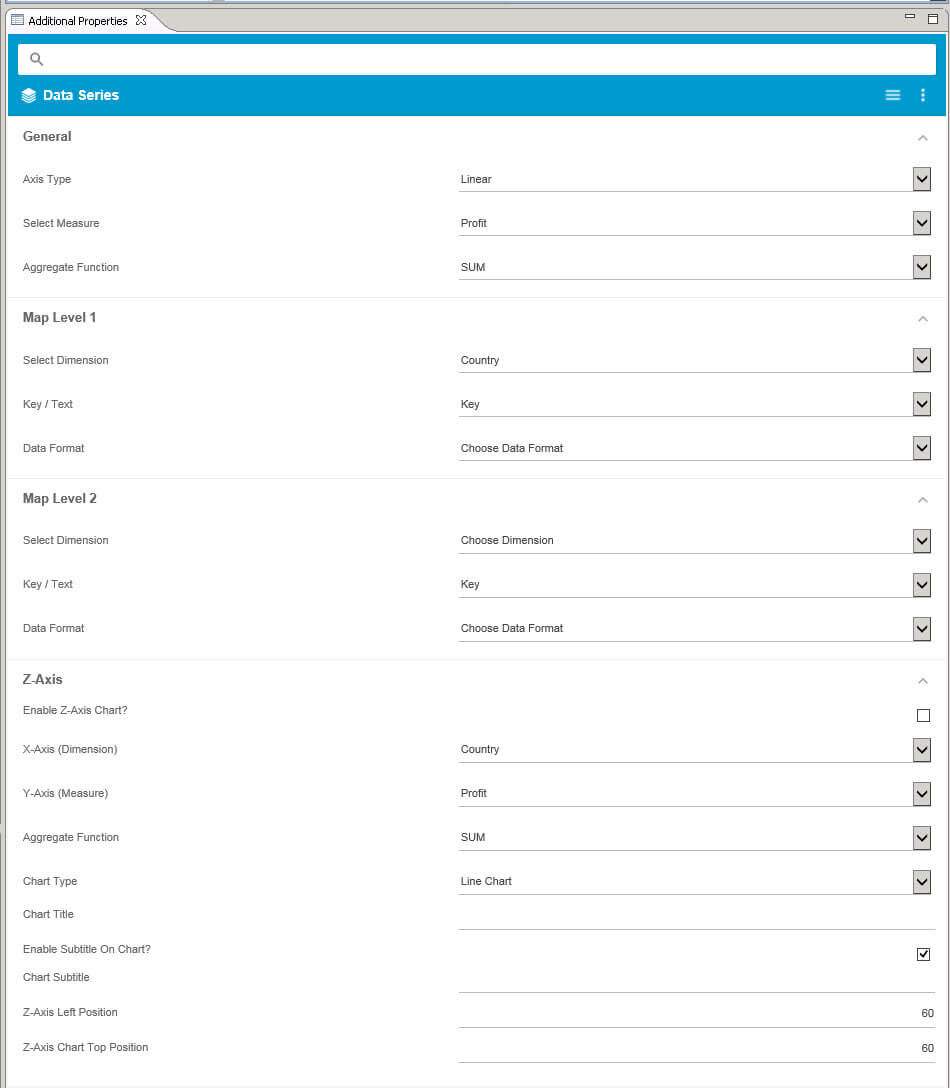
In the category Data Series we are now going to configure the details of how we would like to map the data source to our actual map. In the General area we can select the measure and the axis type (linear / logarithmic). In our example we use the measure Profit with a linear axis.
Now we can configure the 2 levels of our map and select which geographic dimension we would like to use from our data source . In our example the first level will be the dimension Country and we are going to use the Key value from the dimension, and for the second level we are going to use the dimension Region with the Text value. Especially the option to select the key or text value comes in very useful when – for example – the key value is not a regional “key” but instead an internal key value, as you can then reference the text value from the dimension for the map.
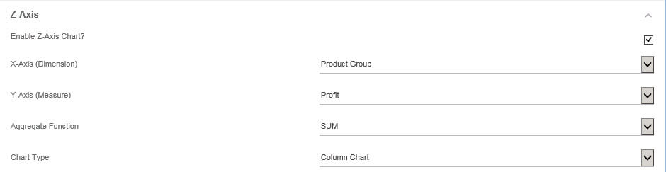
As last step in this configuration we are setting up the details for our Z-Axis feature. The Z-Axis feature allows us to integrate an additional – non geographic – dimension, so that we can very quickly compare values across the different countries or regions. For our example we are using dimension Product Group with the measure Profit and we would like to see the comparison as a Column Chart.
That is all we needed to do. We can now execute our dashboard and as first step we will see the World map.
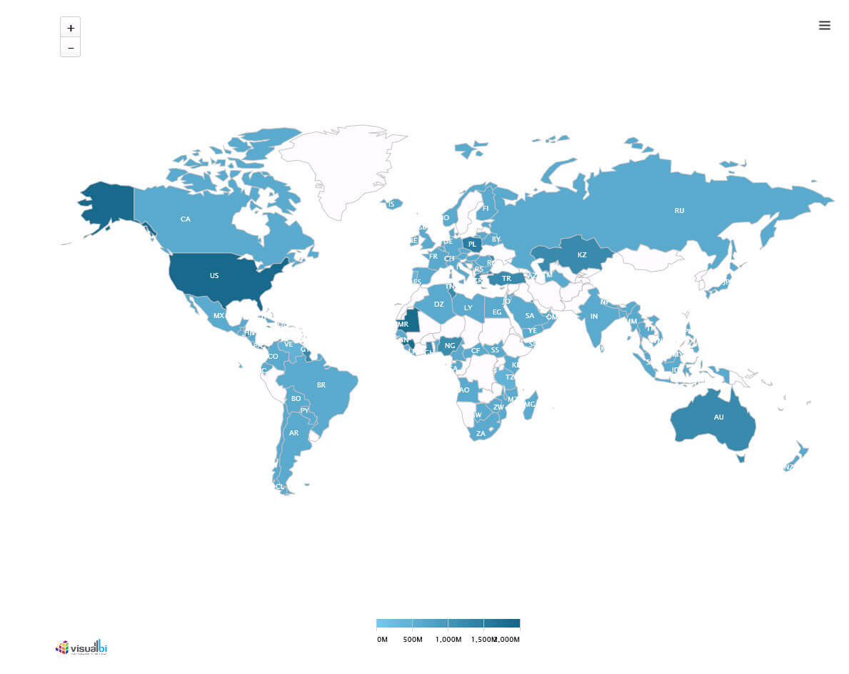
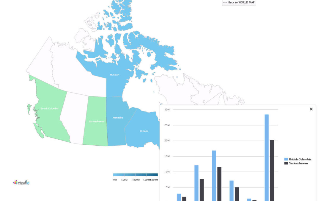
A simple double-click on Canada shows the next level of details (did I mention that I am living in Canada=J ).
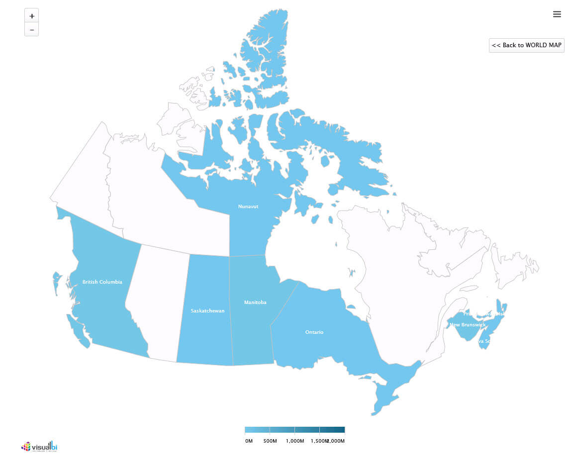
And another simple selection of some of the provinces in Canada brings up the Z-Axis chart, which allows me to very quickly compare the revenue across the Product Group and the selected provinces in Canada. This Z-Axis feature is available on any map level, so for our example the World Map and the individual Country maps.

So as you can see we were able to create a map that offers drill down functionality and a third dimension for comparisons in just a few steps using the Design Studio Extension Map component.
So what else is possible with our maps ?
- All our maps come with export to PDF, JPG, or PNG
- All our maps come with a Print option
- All the maps are fully supported on your mobile device, including the Z-Axis feature
- Our maps support (so far) up to 2 levels of drill down (more to come very soon)
- All our maps support the scripting in SAP BusinessObjects Design Studio and events such as OnClick and the ability to receive the selected values
- Our maps are hosted on servers around the world to provide the best possible access for your mobile users, but can also be hosted onsite if needed
So is integrating maps into your dashboards “complicated” ? I would hope that you – after seeing how easy it can be done – would disagree with such statement and find it easy to integrate maps into your dashboards.
In the next part we will take detailed information with longitude and latitude values and create different layers of mapping as part of our dashboard.
In case you are interested to leverage your own data and see how easy you could integrate some maps into your dashboards, feel free to register for our 30 day free trial below.