

In this blog, we will be looking at dot plot and some of its variations – lollipop and dumbbell chart as an alternative to column/ bar charts
Dot Plot
Introduced by William Cleveland, the dot plot is a type of graph where each of the data points are marked by a dot which help interpret and compare values for each of the categorical variables.
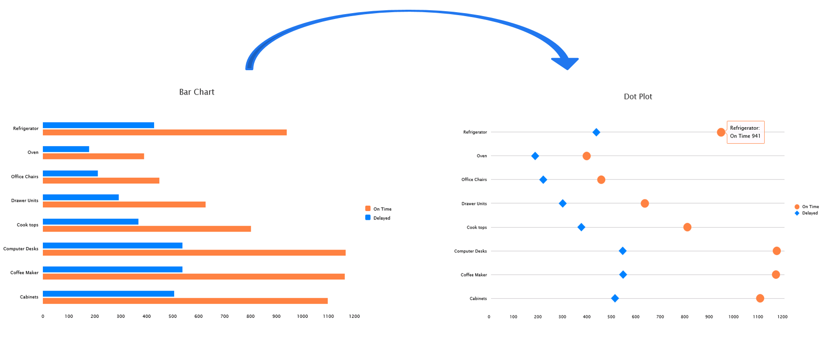
As seen from the below example, it easy to read and compare dots on a line as they provide a much cleaner look and have a high data ink ratio as compared to the column /bar chart. The Dots of subsets are assigned with distinct colors or shapes, making them easily distinguishable. For comfortable viewing a dot plot can accommodate anywhere between 1-4 dots on a line beyond which it would look cluttered. This becomes especially useful when you have column or bar charts with 4 different measures all stacked against each other.
Lollipop
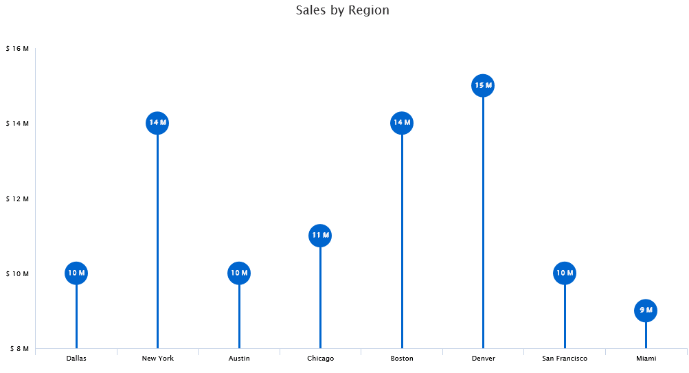
The lollipop chart is a variation of the dot plot where the vertical line stretches only till the dots. Unlike the dot plot the lollipop chart is used to display only one dot per line. It’s a good alternative to column/ bar charts while viewing substantial amount of data(bars) as they provide a spread-out look by using lesser ink and have a ‘high data ink ratio’.
Dumbbell
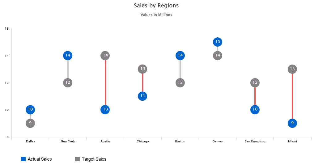
As mentioned in the earlier blog about Dumbell charts, Column charts might not be the ideal use case for all scenarios, especially when you have values that are very close to each other, it becomes very hard to visualize the difference between the columns. The Dumbbell chart, also referred to as a Barbell or DNA chart, is a variation of a dot plot where in, the 2 dots are connected by a line, signifying the change between the 2 data points for each of the dimensions. As compared to regular bar or column chart the dumbbell chart is relatively more visually appealing and effective for certain scenarios. They also look much cleaner since they require lesser ink and real estate on the dashboard.
Implementing Dot plot Chart using VBX
We would be making use of a line chart and tweaking the data series color and grid lines to create a dot plot.
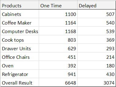
Sample Data
Step 1: Drag the VBX Line chart, connect the data source to the chart and navigate to the Data Tab
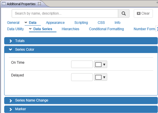
- Under Data Series, select the Series color and set the color for both the series to White (we need to hide the lines and display only the marker)
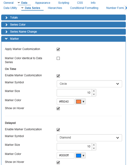
Step 2: Scroll down to configure the Marker properties
- Check the marker customization option
- Uncheck the option – Marker color identical to Data Series
- Enable the marker customization option for both the Measures
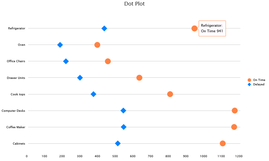
- Set the Marker symbol as desired (On time – Circle and Delayed – Diamond as seen below)
- Set the Marker color as desired (On time – Orange and Delayed – Blue as seen below)
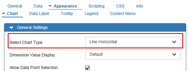
Step 3: Navigate to the Appearance tab and select Chart
- Under general setting set the chart type to Horizontal Line chart
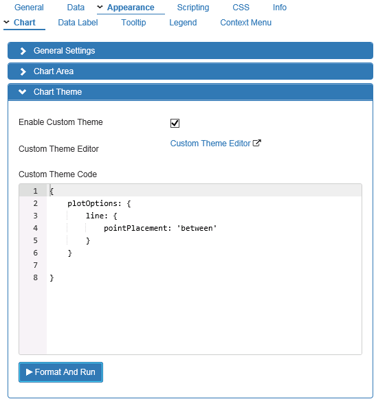
Step 4: Scroll down to the Chart theme and enable the custom theme property after typing the following custom theme code
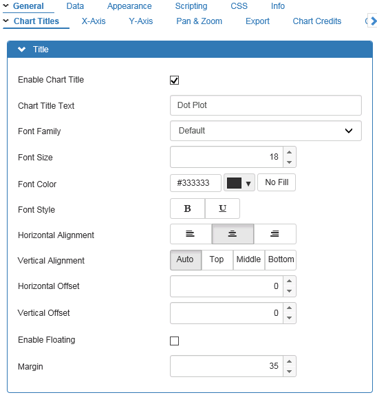
Step 5: Navigate to the General Tab and select Chart Titles
- Enable the Title and set its properties – title text, font, alignment and color
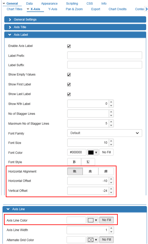
Step 6: Next select X axis sub Tab and set the following properties
- Horizontal Alignment along with offset for Data Labels (this can be different for you based on the size of the chart)
- Axis line color to white for a cleaner look
- Axis grid line settings – line color, style and width

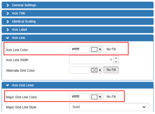
Step 7: Next select Y axis sub Tab and set the following properties
- Axis line and Axis Grid line color to white/No fill for a cleaner look
Finally, we have a Dot plot displaying On Time vs Delayed shipment by products
Looking to create your own Dot Plot in SAP Lumira Designer?
Click here to download a FREE 15-day trial of VBX for SAP Lumira Designer (VBX)