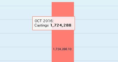
The need to include percentage value in tooltips is that it allows us to make the visualization neat and less cluttered. Especially in mobile devices, where the size of the screen is small, the data value and corresponding percentage presented in tooltip instead of data labels offers clean look of the chart.
The Custom theme option in VBX facilitates customizing colors of data labels, series and tool-tips by passing a JSON object.
In VBX, while using a Stacked Column Chart or Pie Chart, we have the option to display the percentage of each data point in data labels but not in tooltips.
For displaying the percentage value in tooltips, we need to use the Custom theme option. Follow these steps:
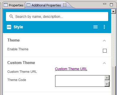
- Enable the Custom theme option under Style in Additional properties of the respective VBX Component:
- Use the following in ‘Theme Code’:
{
tooltip :{
formatter: function(){
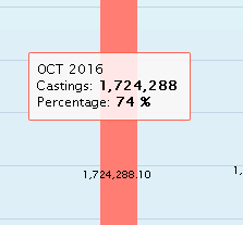
return this.key.name + "<br>" + this.series.name + ": <b>" +
Highcharts.numberFormat(this.y, 0,"",",") + "</b><br> Percentage: <b>" +
Highcharts.numberFormat(this.percentage, 0) + " %</b>";
}
}
}
this.key.name – The member of the dimension in the Axis
this.series.name – The member of the dimension in the Stack.
- Click outside the Custom theme option and Click Save
- You can also vary the formatter for different formats. Since the Custom theme overrides any setting placed in Additional properties, for setting the prefix and suffix, you can include it in the code.
return this.key.name + "<br>" + this.series.name + ": $<b>" +
Highcharts.numberFormat(this.y, 0,"",",") + "K</b>"
Here the $ and K are included as Prefix and Suffix.
The parameters passed for numberFormat in the order – Number to be displayed, Number of decimals, Decimal Separator, Thousand Separator.
The parameters passed for percentage – Number to be displayed and Number of decimals.
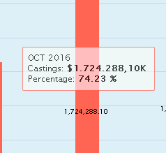
Here the same code has been modified to have 2 decimal places, ‘,’ as decimal separator and ‘.’ as thousand separator. The percentage value also has been modified to have 2 decimal places.
The Custom theme for percentage can be used for Stacked Column Chart(VBX), Pie Chart(VBX) and Donut Chart(VBX). By using Responsive UI(VBX) and getting the profile of the device, we can dynamically toggle the visibility of data labels.
Click here to know more about VBX for SAP BusinessObjects Design Studio.