
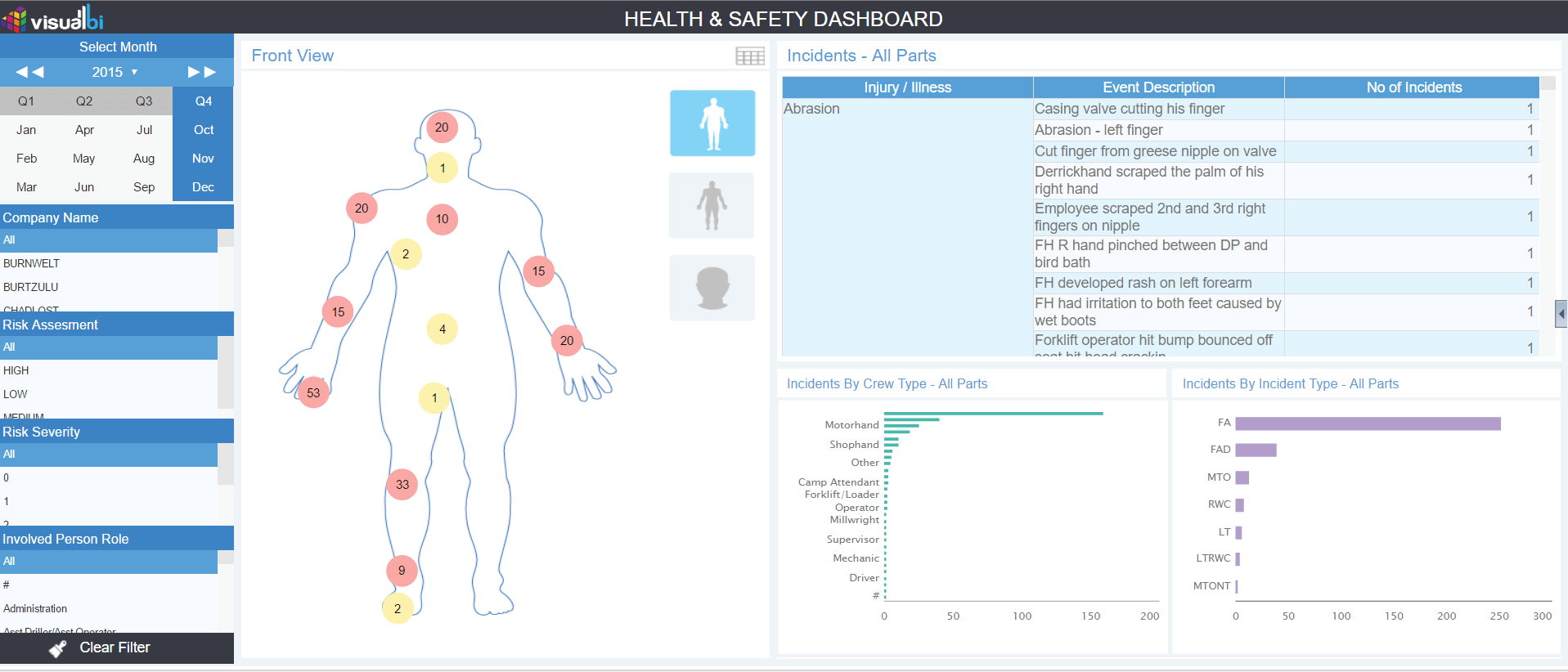
In many organizations , dashboards translate into layouts with a lot of charts and tables. We have shown a use case where Occupation Safety and Health Administration Standard (OSHA) metrics has been superimposed on a visual to make them expressive and visually appealing.
OSHA is a widely-used metric standard for all manufacturing entities to assure safe and healthful working conditions by setting and enforcing standards and by providing training, outreach, education and assistance. The standard comprises of multiple metrics which measure anything from injuries on the factory floor to maintenance in the corporate offices. As part of compliance requirements, enterprises must report their metrics periodically to ensure that their work spaces are safe and legal to work.
These OSHA metrics are usually tracked and presented on Excel or tabular reports to ensure that regulations are met, and usually lack the visual representation that might be needed to clearly present the risks of injuries or insight that can be used to avoid such injuries.
So, when we were tasked with presenting these metrics, we challenged ourselves to present them in a visually appealing and interactive dashboard for Plant Managers and Operators which would then get displayed on large screen monitors on the shop floor to drive awareness on injury spots and occurrence rates.
Using SAP Business Objects Design Studio and VBX – We showcased the safety record of the company across different body parts and time frames. In the example below, we wanted to analyze the count of injuries by body part for specific roles. Conditional formatting was then applied on the injury count to highlight areas of concern and drive attention accordingly.
A different perspective for the same …
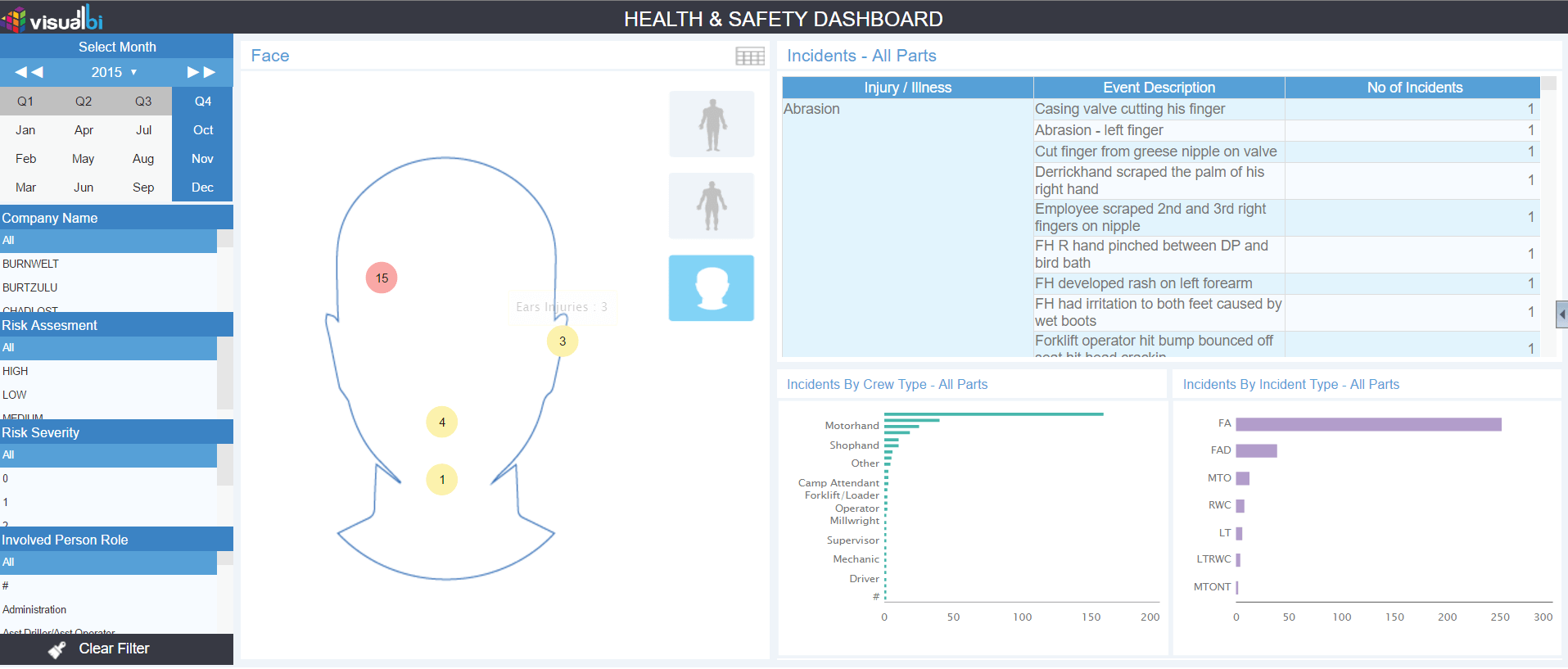
VBX allow you to superimpose a Bubble chart on top of other images and use conditional formatting to effectively deliver insights. In the case above, each bubble has been sized the same and the number of incidents for the body parts has been highlighted using conditional formatting. This same principle can be used in various scenarios – think “parts of a car that are frequently malfunctioning within a service station” etc.
Additionally, you can also leverage the Bubble Size as a visual factor – you could have 2 measures like Injury count and lost work days where Injury count could drive the bubble size and lost work days could define the conditional formatting for the bubble color.
(Additional blog credits to Arun Ravindran and Eshwar Prasanna)
Click here to learn more about VBX for SAP BusinessObjects Design Studio.