A typical Challenge – Making dashboards easy to consume for internal and external audience
How do you transform your dashboards to make them user friendly with images?
A common limitation with tables in most reporting & visualization tools is that they are exclusively text-driven. However, when the data deals with technical information like Material numbers or products codes, the reports can be made more striking by using thumbnails or images withing tables to deliver a comprehensive user experience (UX).
Consider the scenario….
How can you use SAP Design Studio to make your dashboards self-explanatory using Images within Tables?
One common problem while making dashboards for a larger audience is the ability to make it lucid enough for everybody to comprehend the information.
A Possible Solution
Imagine a Sales dashboard with sales information for hundreds of SKUs. To cater to a wide audience across the whole organization including the people on field it becomes very difficult to remember the SKUs by product code. One simple way of doing this is by having images along with the product names. So, if you were a Sales rep or a Product manager responsible for a product group, it would become a lot easier to understand the product. Especially in case of products having the same name but different SKUs numbers due to difference in their attributes like color, texture etc. This also makes it easier to present the dashboard to an external audience and avoid having to translate the same into user understandable information offline.
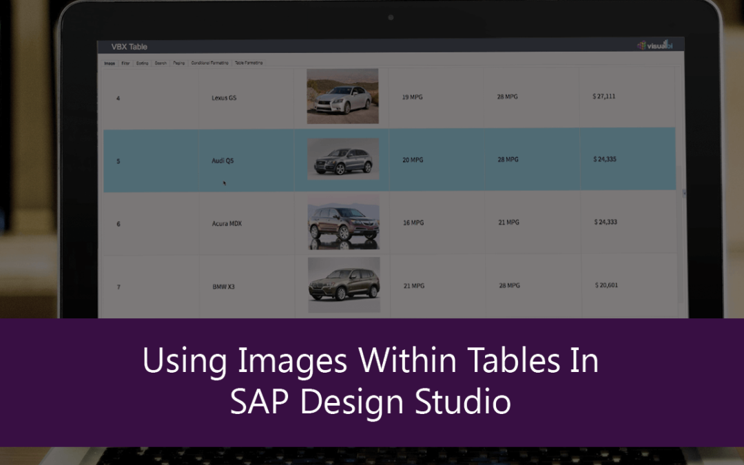
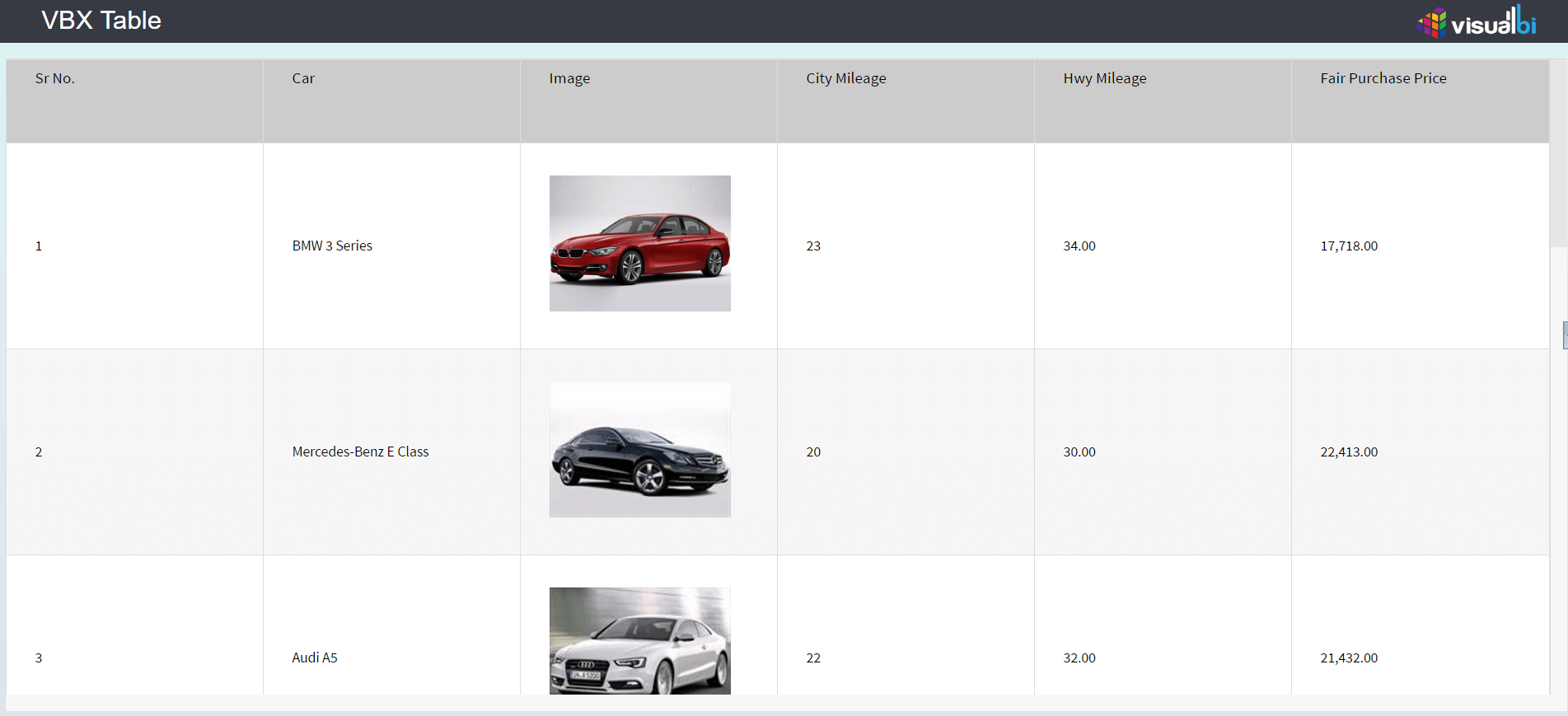
To illustrate this use case, we built a dashboard comparing cars in SAP Design Studio. When we inserted images within tables, it made it intuitive for the user to comprehend the information easily since images is something that the user can relate to easily. This was achieved using the VBX Table component. The VBX table component is a powerful add-on which apart from rendering images also allows for a host of other features including.
Note: This is recommended for Tables with less than 100-200 rows of data beyond which the performance will degrade
- Interactive Filtering and Sorting
- Search option
- Data Utility – pivot data
- Advanced Conditional formatting: Value, Background, Symbol
- Flexibility to create a separate Alert column and calculated key figure
- Paging
- Freeze Header
- Text Wrapping
- Built in Table formatting: CSS, Dimension and Measure formatting
The same has been highlighted in a video showing how the advanced table component can help address some typical dashboard challenges out of the box without having to script around the requirements.
Click here to download a FREE 15-day trial of VBX for SAP BusinessObjects Design Studio.