Better tiles make better dashboards – 10 features to enhance your KPI tiles
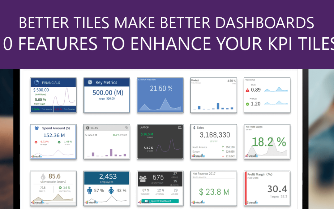
A tile-based approach is the most commonly used approach for dashboard building. In many cases, the tiles become indistinguishable on the landing page. At Lumel, we are all about helping businesses navigate their data better with the best visualizations possible. Below, we have listed some of the interesting features of our KPI tile component which can help you take your dashboard to another level making it one that your users will love.
Advance Conditional formatting
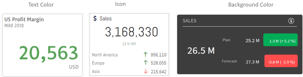
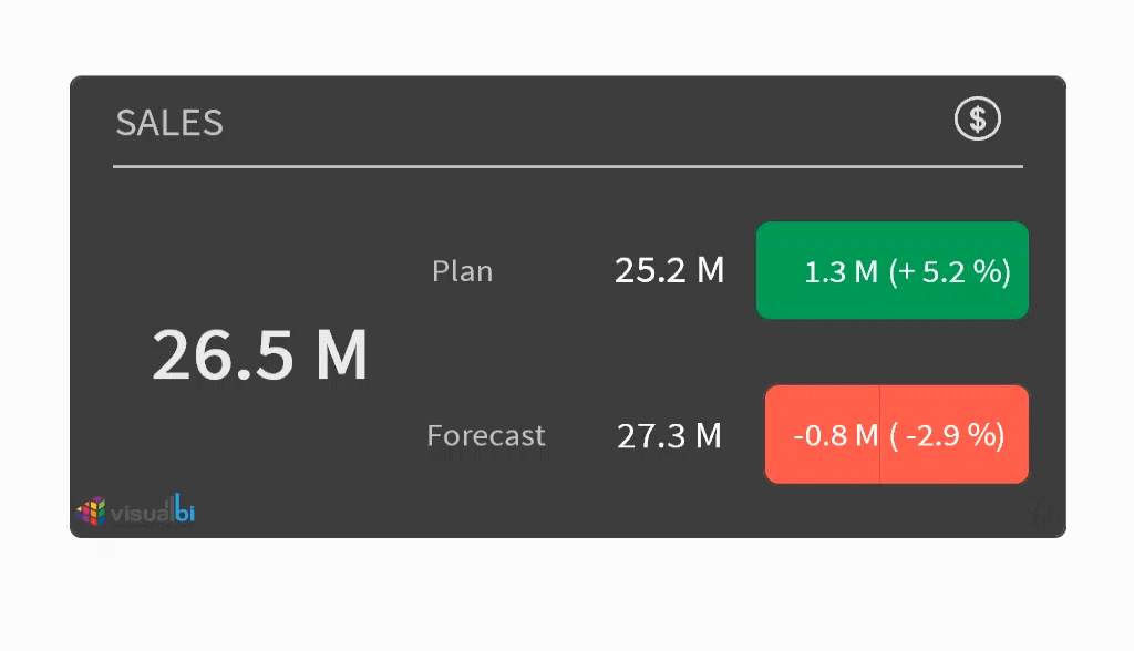
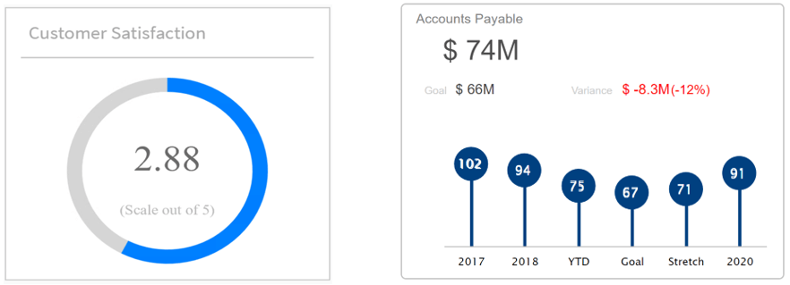
A common requirement when it comes to the KPI tile is, to display alerting. One of the best ways to achieve this is by using conditional formatting. The VBX Advance KPI Tile provides robust conditional formatting options with the following capabilities:
- Icon – Ability to change Icon symbol, color and rotation
- Background Color
- Font color for KPI
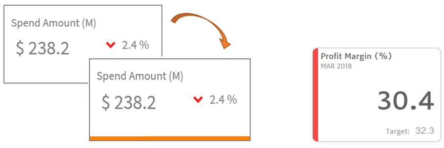
Status indicator
As the name suggests, the status indicator can be used to indicate the state of the KPI tile. For example, a status indicator could be used to indicate the health of the metrics i.e. (positive or negative) or to differentiate a selected KPI Tile from others.
2 sided KPI tile
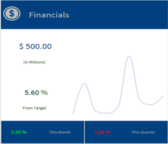
Often, we come across a situation where you would like to show a sparkline chart or additional information about the KPI but are limited to the real estate available. For such situations, you can now make use of the second side of the KPI tile. The advance KPI tile provides you the ability to configure both the front and back sides of the KPI tile and display additional information by flipping over to the other side of the KPI tile. For example, you could display Sales related KPIs on the front side and a sparkline chart on the back.
Dynamic container
Why be just limited to the basic sparkline charts? Dynamic container allows you to add any component to your KPI tile. Yes, you heard that right, ANY! Not only can you add any chart, but you may also leverage the detailed property sheet to make your charts look more appealing and informative.
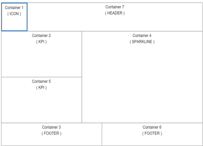
Customizable KPI containers
You can easily customize and create your own KPI design with the help of different KPI containers. Each of the containers can be assigned a different data source with the ability to consume both static or dynamic data. The different KPI containers are as follows:
- KPI
- Icons
- Header
- Footer
- Sparkline chart
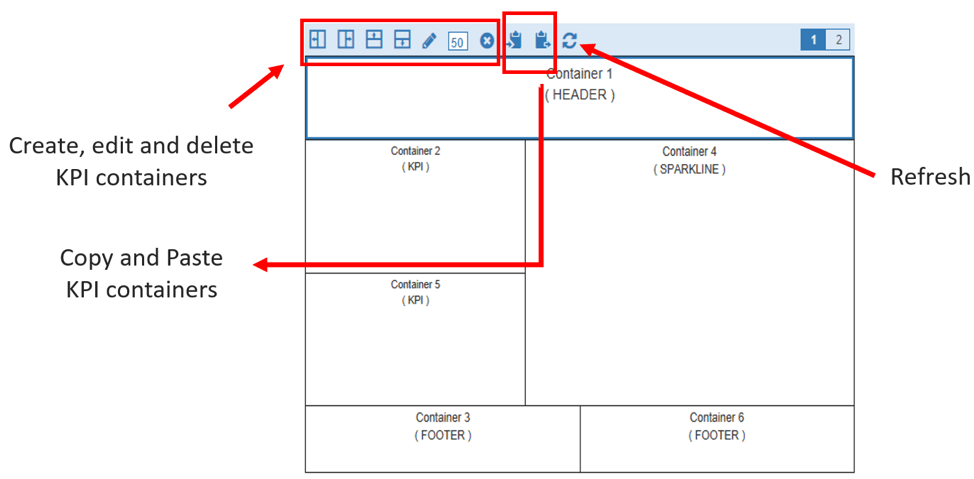
Flexible KPI Layout
Designing KPIs can be a lot easier now thanks to the simple and flexible design. You can quickly create new KPI containers with the help of the container icons – horizontally, vertically, on the right or left and define the exact proportions for each. Once a KPI container is designed, you may reuse it by simply copying and pasting it to the other containers.
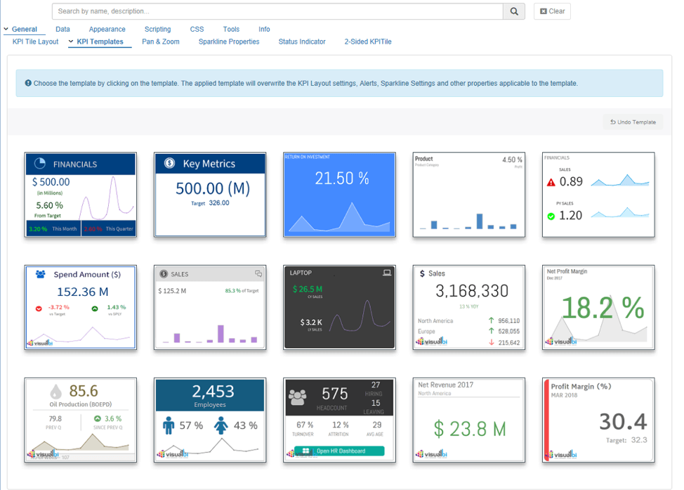
KPI Templates
Being a great designer or a CSS expert is no longer necessary because now you can make use of the newly added KPI templates to help you cut down on your design time and provide different KPI designs based on your business requirements. You could use these KPI templates as a good starting point and customize it based on your needs.
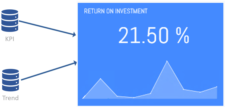
Multiple data source
You can now consume multiple data sources as part of the advance KPI tile configuration which would enable you to consume different data sources for each of the KPI tiles. For example, you could connect the KPIs coming from one data source and trend chart displaying trend information from a different data source
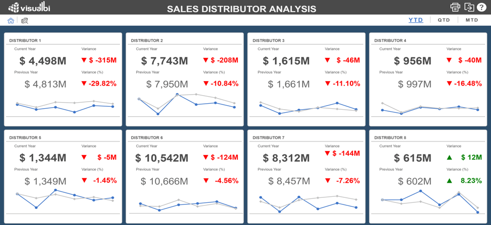
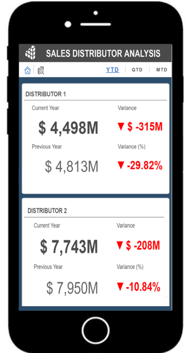
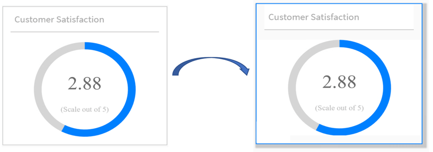
Responsiveness
One of the important considerations during dashboard design is to make the KPI tile scale according to different screen sizes and resolutions. One of the ways of doing this is by using the VBX responsive UI container, which helps you define the KPI layout according to different screen sizes and devices. For example, while viewing the dashboards on the desktop you could display the KPI tile with a trend chart whereas while viewing on an iPhone (which has a lot less real estate) you would like to view only the text (numbers) and not the trend chart.
On desktop – KPI tile dashboard with sparkline chart
On Iphone – Same KPI tile dashboard without sparkline chart
Selected Mode
Often, you would come across a scenario where you would like the KPI tiles be clickable so that you could select the KPI and filter the dashboards based on it. For this, you would like the selected KPI to stand out so that the users could identify the selected KPI tile. This can be done easily by using the selected mode where you customize the UI elements, like the background color, border color, and provide a shadow effect for the KPI tile.
Give the Advance KPI Tile a try by downloading the FREE 15-day trial of VBX for SAP BusinessObjects Design Studio / SAP Lumira Designer – VBX. Additional information on KPI Tiles Temples can be found here.