A common question from customers today is: How to make SAP Lumira Designer applications scalable across all screen sizes and device types? Whether it’s a mobile device (phones, tablets…), desktop, or large monitors, users want a responsive design where the application will dynamically adjust to different devices and screen sizes.
Instead of creating separate applications for different device types, we can now make the applications responsive. They can change their orientation based on the device in which they are consuming the applications. One way of achieving this responsive behavior is by using the VBX Responsive UI Container. Let’s look at some of the use cases for responsive design and what one can achieve with the Responsive UI Container:
1. Dynamically adjusting dashboard orientation based on Device profiles
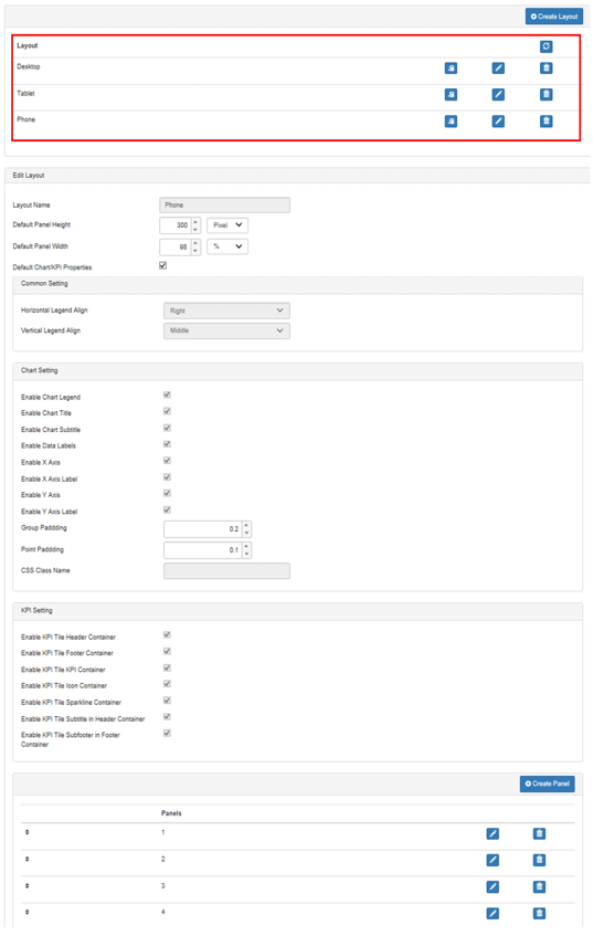
One of the most important aspects of responsive design is to automatically adjust the dashboard orientation to different screen sizes and device types. With VBX Responsive UI container you can define different device profiles and assign them to different device types.
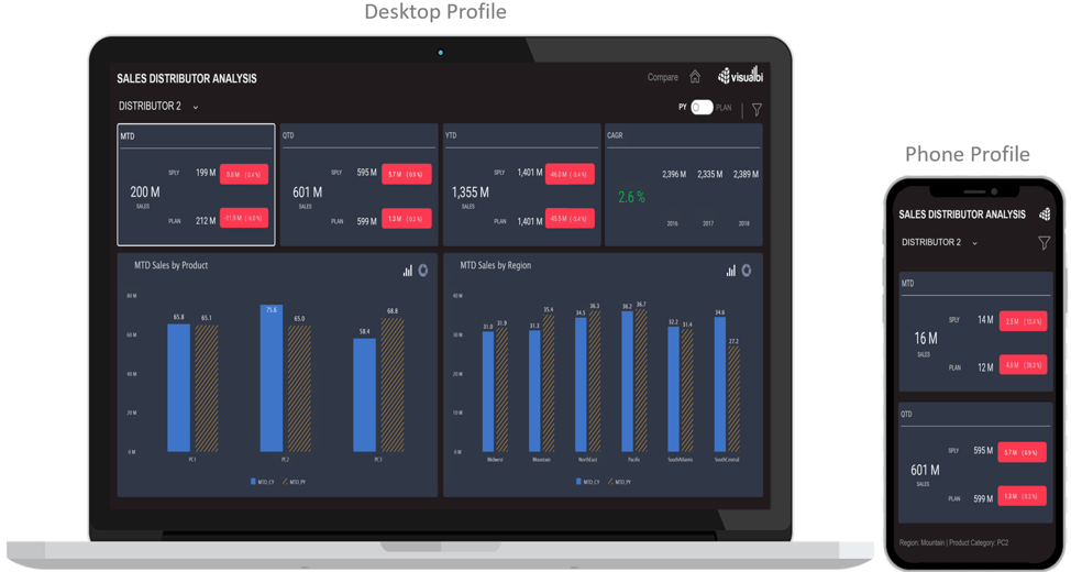
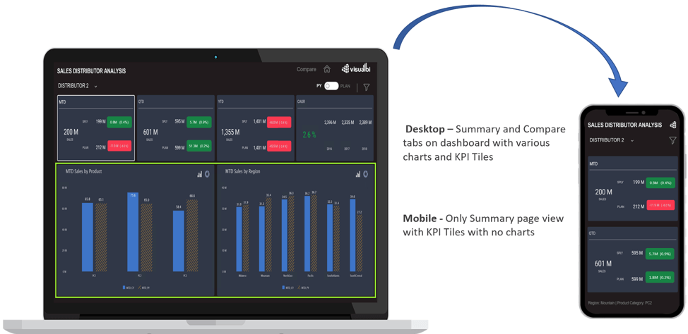
From the example below, you would notice that the same dashboard looks different on mobile device (phone) and a desktop. This can be achieved by defining different screen profiles and assigning them to the respective devices. Within each device profile you have the ability to design the responsive panel layout differently (different height and width), thus enabling the dashboard to dynamically change based on the profile.
2. Delivering different renderings based on Device profiles
Even though the information displayed on the dashboard is the same across all the devices, it needs to be curated specifically to the device type. For example, the use case of viewing the same application on a mobile device and desktop could be different. A typical example could be something like a salesman viewing information that he/she needs quick access to on the phone while needing detailed information when accessed from a desktop.
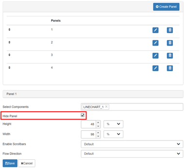
One of the ways of doing this by using the hide/ unhide feature of VBX RUI Panels, where we can alter the visibility of the responsive panels to deliver custom UI experience for different device types as seen in the below example:
3. Control component visibility for Device-Specific UI design
Not only can we control the visibility of the Responsive UI panels set up in the VBX RUI but also the visibility of other components.
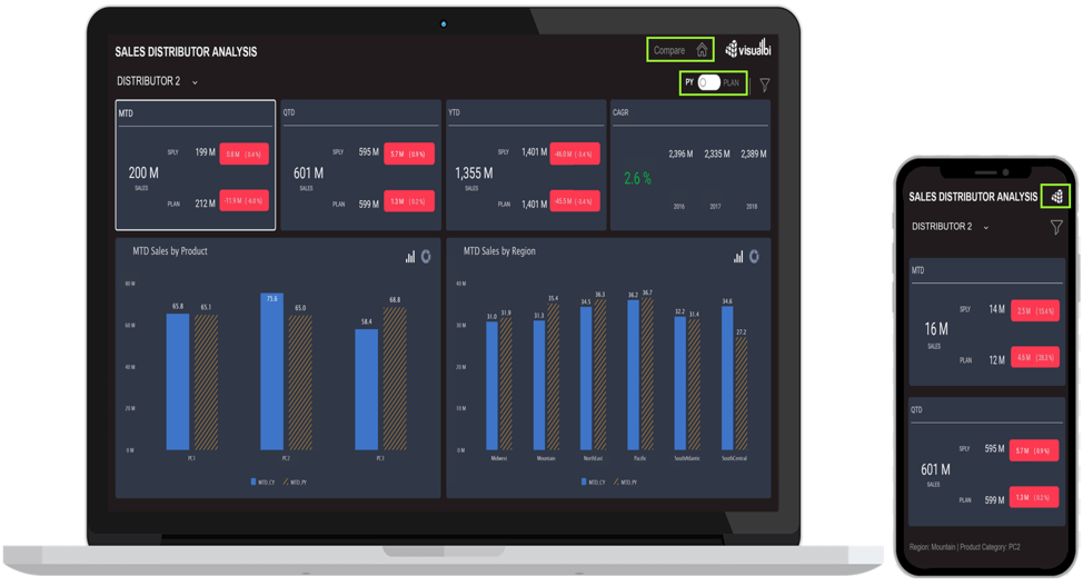
For example, as seen below in the case of Desktop profile, the dashboard would contain all the tabs (Home, Drilldown and Compare) and buttons (e.g. Toggle Button for Plan and Previous year). Whereas, in the case of Mobile, you would like to look at a simpler user case of viewing only the main KPI values for each of the distributors. Hence, you would notice some of the tabs, buttons, or other UI elements getting hidden in mobile. Also, due to the limited real estate on a mobile device, you would like a lower/smaller version for your company logo to be displayed as compared to the actual company logo on the desktop.
4. Altering Panel properties and visibility on runtime
Apart from altering the visibility of the responsive panel, we can also change the size of the panels on runtime. The size of the panels can be assigned both in percentages and pixels.
Imagine a use case of having a common dashboard for the entire organization, where each user would like to view a different set of KPIs. For example, an analyst would like to see all the KPIs (all 7 of them), however, as a lead, you would just like to see a subset of it (let’s say only financial KPIs).
5. Font Scaling
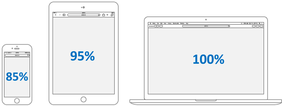
A very important aspect while designing responsive applications is to have responsive text. Text that can adapt or scale according to any screen size or resolution. For example, on a desktop you would like to look at the actual font size, but in the case of a mobile device like an iPad or iPhone, you would like to scale down the font size for more comfortable viewing. With VBX’s responsive UI container, you can define the fonts in percentages based on the device profile.
6. Alter component look and feel based on device Type
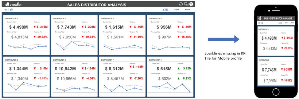
Another way of creating custom UI experience is by altering component properties based on the device profile. The VBX Responsive UI container provides the ability to override chart properties and Advance KPI Tile settings as part of the layout configuration. For example, you could configure the legends of the charts to be displayed on the right-hand side when viewed on a desktop, below the charts when viewed on a iPad, and hide the legends altogether when viewed on an iPhone, based on the available the real estate. Another example would be a KPI tile with a trend chart (as seen below). When viewed on desktop as compared to an iPhone (which has a lot less real estate) only the KPI numbers are made visible and the spark line is not.