Histogram is an effective way to display the frequency distribution of measures across a continuous data set. They offer an intuitive way to analyze large amounts of data.
While a Histogram is used to plot the frequency of occurrence of data across a continuous data set which is divided into bins, a column/bar chart is used for a variety of other instances.
Data analysis with the help of a histogram proves to be useful in cases where:
- Reliability of mean value needs to be verified: If a histogram is a bell curve, which means the left and the right half of the histogram are mirror images, then the center of histogram is taken as the mean. If the frequency distribution is left skewed, then mean is lesser than the median. If the frequency distribution is right skewed, then the mean is greater than the median.
- To capture trends: Histograms, when used to analyze data across time, age groups, salary packages, net worth etc. prove to be a handy visualization tool to capture trends.
- To identify outliers: It serves the useful purpose of highlighting outliers in a data set. This in turn focuses on probable errors that might corrupt a data set or factors that might have caused this unusual outcome. Identifying outliers is an essential step in data cleansing. Histogram serves this purpose.
Do you have a structured data specific for a histogram? Are you looking for an easy way to design a histogram in SAP Lumira Designer?
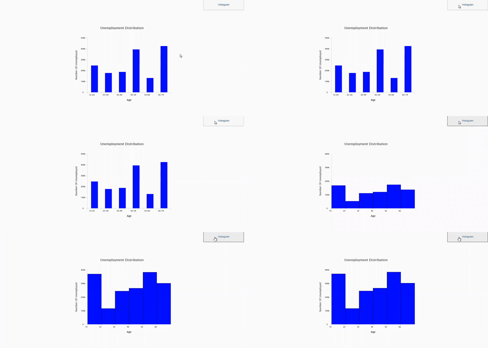
With VBX Column/Bar chart, it is possible to transform a Column chart into a histogram in a matter of seconds.
Below is an example of a data that represents the number of unemployed across different age group
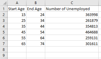
Start age is placed in the X axis of the chart and Number of Unemployed is placed in the Y axis of the chart.
If this is directly consumed in a column chart, each column would appear as though it is reflecting the value for a discrete data (Example from the above data set: it would appear as though the number of unemployed for age 15 alone is 363998, which is a false representation). However, the data we are using is a continuous data set where the ages are divided into bins of width 10. In the above dataset the Number of Unemployed is grouped across different age groups, example: 15-24, 25-34, 35-44 and so on. A histogram would prove to be an ideal way to represent this data set.
Let’s build a histogram using this data set:
Step 1: Add a VBX Column/Bar chart in your layout.
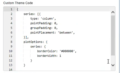
Step 2: In the additional properties of the chart, go to Appearance->Chart->Chart Theme->Custom theme code and enter the following code. Click on the format and run option to watch your column chart transform into a histogram.
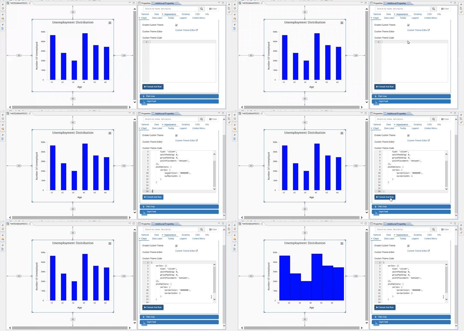
Histogram is ideal for a continuous data set, while a column chart is ideal for discrete dimension members.
Click here to download a FREE 15-day trial of VBX for SAP BusinessObjects Design Studio / SAP Lumira Designer VBX.
