
This blog takes a quick look at how the Sunburst Chart is a very intuitive visualization for BW hierarchical data. A Sunburst Chart is a multi-level pie chart used to represent the proportion of the different values at each level of a hierarchy. This chart is often compared to the Treemap Chart, which is also used to show hierarchical data. A Sunburst Chart does a better job of showing how the data at a particular level of the hierarchy relates to the data at each of the higher and lower hierarchy levels. It also clearly displays the full depth of the hierarchy. This chart is part of Visual BI Extensions (VBX) for SAP Lumira Designer.
Clear view of hierarchical data
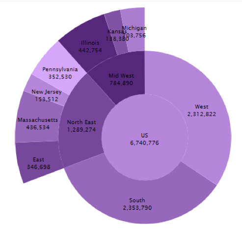
The concentric rings represent the different levels of the hierarchy, the innermost being the top of the hierarchy. The slices in the rings clearly indicate the categorical grouping at each level of the hierarchy. The width of the slices indicates their proportionate values within the parent group. The variation in the width of the slices helps in intuitive visualization of how they compare with each other. As you can see in the chart below, Illinois and Massachusetts had maximum sales.
Ideal for viewing proportions
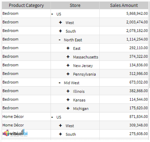
The following illustration shows the tiered structure of the chart and also highlights how easy it is to expand or collapse the hierarchy to focus on a particular hierarchy level and get instant insights into how the categories at that level stack up against each other.
Drill down to deeper categorical levels
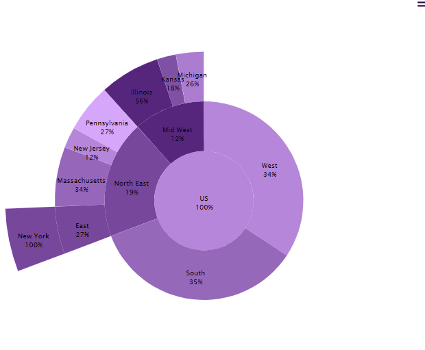
This illustrates how the chart changes dynamically in response to the drill up or drill down through the BW hierarchy in the table.
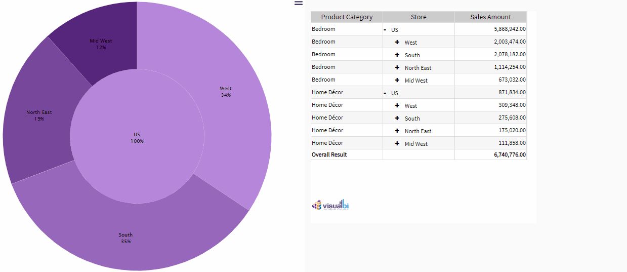
When space is not a constraint, this chart can be used to paint a complete picture of the BW hierarchy and to draw attention to the details with its stunning visualization.
Learn more about VBX for SAP Lumira Designer here.