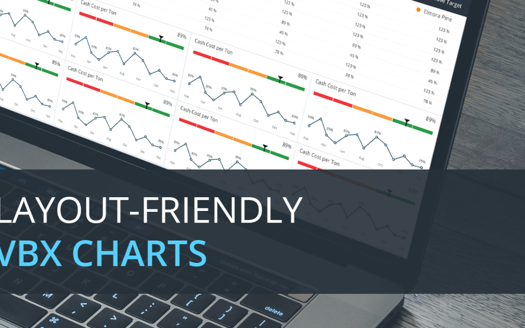
When using Lumira Designer, one of the major problems that the dashboard designers face is optimum usage of the dashboard canvas. When lots of data points are to be displayed in a limited amount of space, the chart is cluttered with points making it hard to comprehend.
VBX Charts provides lot of features as well as the ability to customize the charts according to the needs of the user.
For making the component layout-friendly, VBX provides three options:
- Maximize the chart
- Pan and Zoom
- Scrollable plot area
a) Maximize the chart
We can make a particular VBX chart occupy the entire dashboard on demand and restore it to the original size.
Select the Additional properties of the VBX Chart and go to General -> Context Menu, and check “Enable Maximize option”
b) Pan and Zoom
When we zoom by using select and zoom, the zoomed area can be panned by holding ‘Shift’ and moving the mouse in the direction the user needs to move.
Select the Additional properties of the VBX Chart and go to General ->Pan & Zoom, and check ‘Enable Panning’. You can also change the key for Panning to ‘Shift’ or ‘Ctrl’.
c) Scrollable plot area
We can achieve this in 3 steps:
Step 1:
Add the necessary chart and assign data.
Step 2:
Select the Additional properties of the VBX Chart and go to Appearance-> Chart Theme->Custom theme and add the following code:
{
xAxis: {
min: 0,
max: 6,
scrollbar: {
enabled: true
}
}
}
If the scrollbar needs to be placed at Y-axis, replace xAxis with yAxis in the above code. The min and max options are for configuring the number of data points displayed at a time.
Step 3:
When we scroll, the y-axis gets auto scaled.
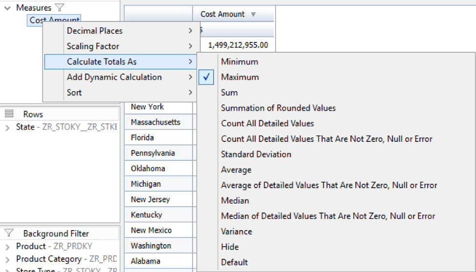
If that functionality is not required, we can set the maximum value of y axis statically.
In the initial view of the data source, modify the “Calculate Total As” option to Maximum for the displayed keyfigure.
Run this code in onResultsetChanged, replacing the keyfigure CUID and Chart Name.
The code gets the maximum amount from the data source and sets the value as Y Axis maximum for the chart:
var maxAmount = DS_1.getData(“ZR9CAMT000000000000000007”, {}).value;
var maxAmountStr = “”+maxAmount;
var maxAmountFloat = maxAmount;
var power = maxAmountStr.length;
var setMax = (Math.ceil(maxAmountFloat/(Math.pow(10, power-1))))*Math.pow(10,power-1);
CB_CHRT.DSXSetYaxisMaximum(setMax);
The code gets the total and calculates the max value, which is rounded off and assigned as Y-axis scale Maximum.
The limitation is that, there must always be more members than the maximum value in the data that we give in the custom theme code.
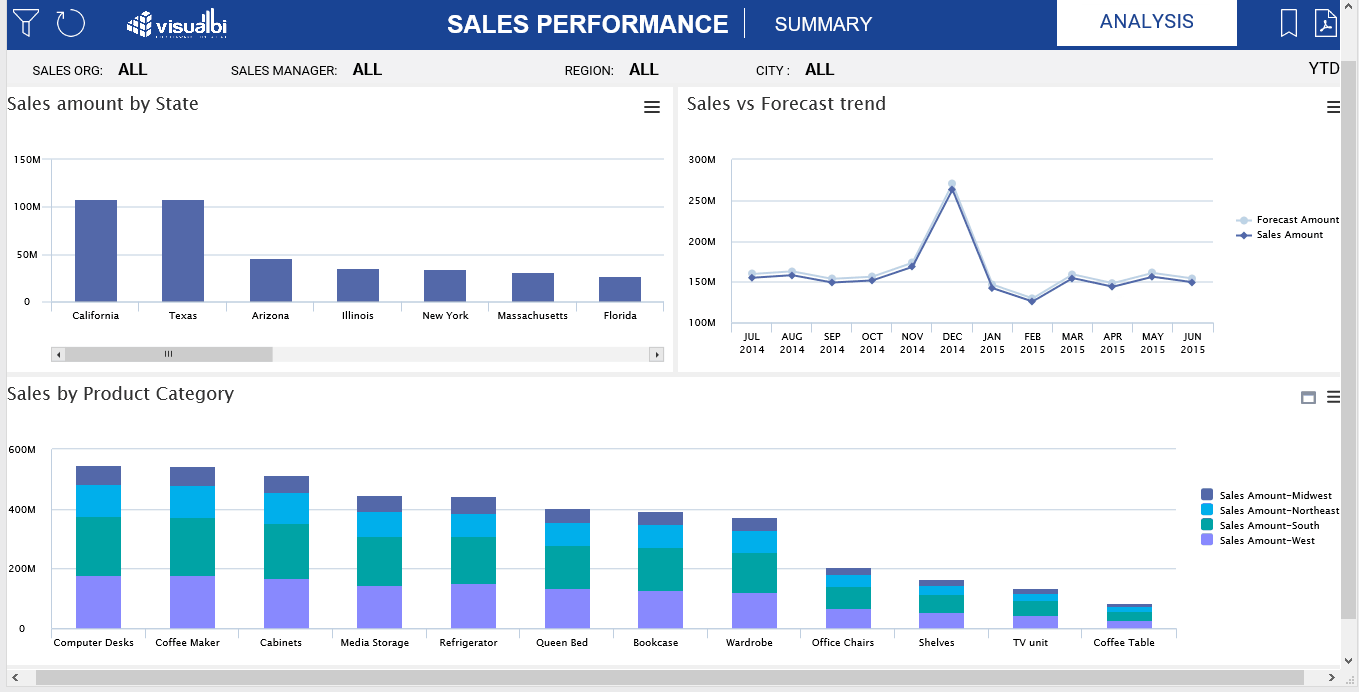
By using these options in VBX, we can utilize the dashboard area better.