At VBX, we are constantly tasked with unique visualizations requested by our customers which challenge the boundaries of what is possible in standard SAP Design Studio/ SAP Lumira Designer. This often leads to a mashup of Standard SAP Lumira Designer and VBX to create visualizations that bring in a lot of value by helping them solve their business problems.
Problem Statement
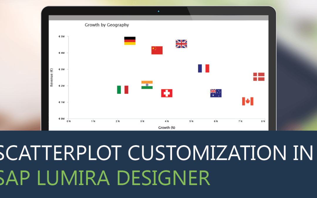
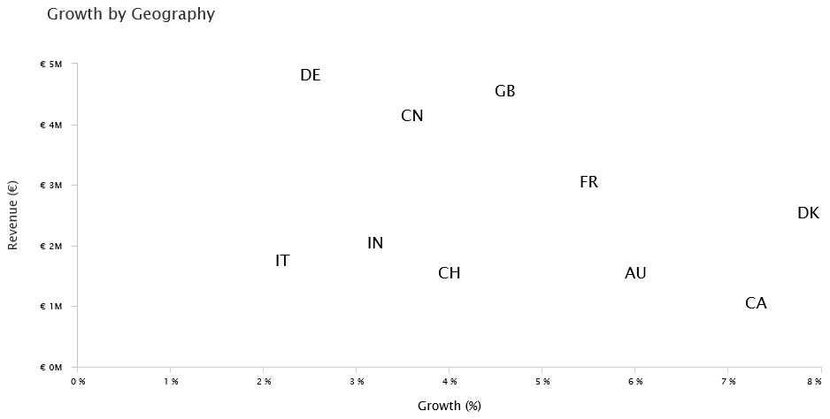
To achieve the following use case, we would need to customize the data labels to display dimension names instead of measures. Such customization would require a lot of scripting and CSS using standard scatterplot in SAP Lumira Designer. This could be easily achieved using the VBX Scatterplot.
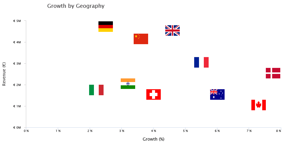
You could also be more creative and replace the county labels with flag images, like one below.
Scatterplot
Scatterplots are mainly used for correlation analysis between 2 measures. They help us understand the relationship between the measures by plotting them on X and Y Axis respectively. This way each data point is an intersection of the 2 values being analyzed which are represented with different symbols and color, depicting distinct groups in some use cases. Further, they are also used for outlier analysis and clustering
Let’s look at the step by step process of fulfilling the above requirement
How to create a Scatterplot usingVBX ?
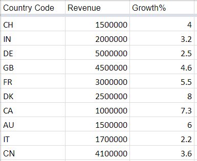
Sample Data
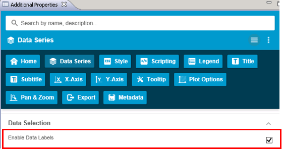
Step 1: Drag the VBX Scatterplot to the canvas and navigate to the Data Series Property Tab.
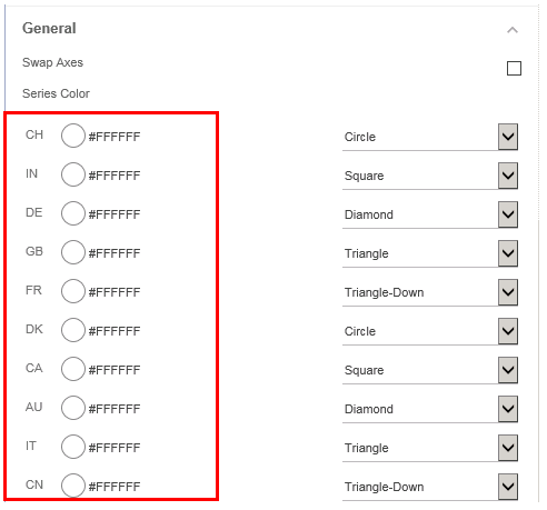
- Enable Data Labels
- Set the Series color to white for all the dimension members (#FFFFFF)
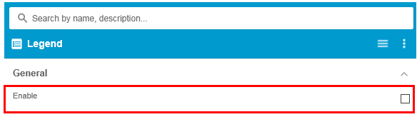
Step 2: Navigate to the Legends tab and disable the Legends
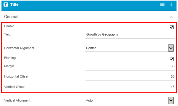
Step 3: Next navigate to the Title tab and set the Title formatting properties as follows:
- Title Text
- Alignment (for more flexibility use Horizontal and Vertical offset)
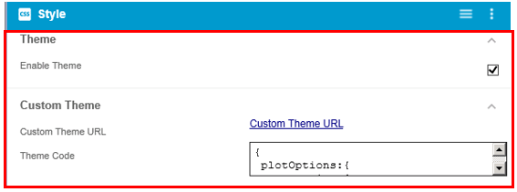
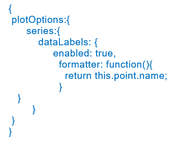
Step 4: Navigate to the CSS Tab, check the Custom Theme property and copy the following script.
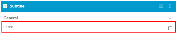
Step 5: Navigate to the Subtitle Tab and uncheck the subtitle option
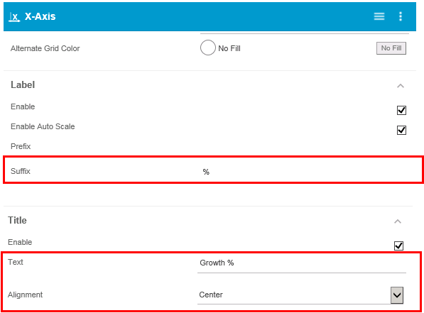
Step 6: Set the X axis properties as follows:
- Set the Label suffix to %
- Set the Title text and alignment
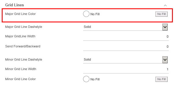
- Set the grid line to color – No fill
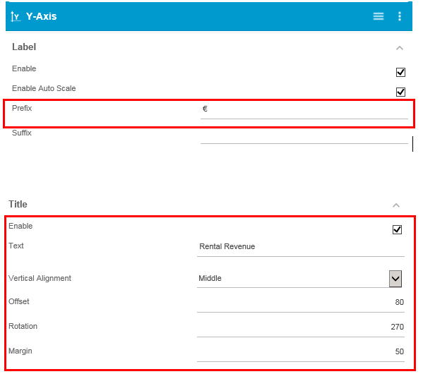
Step 7: Navigate to the Y Axis Tab and set the properties as follows:
- Set the prefix to €
- Set the Title text and alignment

Our scatterplot is ready

You could also create the same by using a Bubble chart with similar customization.
However, Bubble chart requires 3 measures as compared to scatterplots which require only 2 measures. To achieve the above use case using bubble charts, you would need to create a dummy variable for the bubble size.
For innovative use case on bubble charts click here
Click here to download a FREE 15-day trial of VBX for SAP BusinessObjects Design Studio/SAP Lumira Designer.