This is part of the Tooltip and Data Label Customization blog series. In the earlier blog, we looked at displaying multiple measures in a tooltip. In this one, you will learn about showing tables in tooltips in SAP Lumira Designer using VBX tooltip editor pane. This editor allows you to include dimensions and measures in any order with the desired spacing, colors and highlighting.
For this example, we use sample retail sales data with products and their sales amounts. Copy the code given below and paste it in the tooltip editor pane. You could also write your own HTML code here. Replace all the dimension and measure names with your data. You could refer to the blog Displaying Multiple Measures in a Tooltip,for details on how to include dimensions and measures in the tooltip via the tooltip editor pane. The tooltip editor resolves all the spaces and new lines provided in the code. To avoid that, we have minified the code to remove the extra spaces and new lines. You could use some code beautifiers available online to edit the structure of the table. Ensure the code is minified before pasting the template.
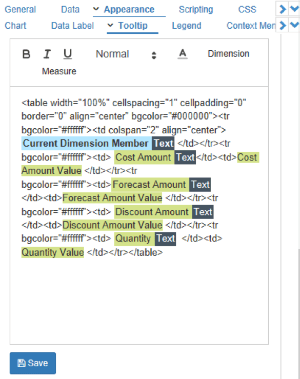
<table width=”100%” cellspacing=”1″ cellpadding=”0″ border=”0″ align=”center” bgcolor=”#000000″><tr bgcolor=”#ffffff”><td colspan=”2″ align=”center”> Current Dimension MemberText </td></tr><tr bgcolor=”#ffffff”><td> Cost AmountText</td><td>Cost Amount Value </td></tr><tr bgcolor=”#ffffff”><td>Forecast AmountText </td><td>Forecast Amount Value </td></tr><tr bgcolor=”#ffffff”><td> Discount AmountText </td><td>Discount Amount Value </td></tr><tr bgcolor=”#ffffff”><td> QuantityText </td><td> Quantity Value </td></tr></table>
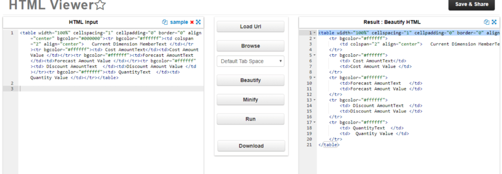
The tooltip editor looks like the image below. You can see that the Dimension Text (which is the heading) has been highlighted to a bold font. This is a simple HTML table template with rows and columns as dimension members and measures. You can edit this structure to have the desired no. of rows and columns to fit your data. This is a beautified version of the above code, to show the rows and columns of the table more clearly.
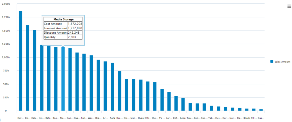
The tooltip with the HTML table is shown below. This can be used in scenarios where the user needs additional information which is not available in the chart data. In this chart, only the Sales Amount is provided in the series, whereas in the tooltip, we display other measures as well. The tooltip in the chart below gives additional information in a clear and concise manner.
If you are interested in customizing your tooltips to display tables, you could register for a free trial and try it out with your own data.