Conceptualization of every idea begins with a prototype. This blog talks about one of the features which comes in handy for Dashboard developers in getting data ready for a Dashboard POC.
The easiest way to model Data for POC is through Microsoft Excel as a data source. This feature, which initially came as a part of VBX 1.6, has been enhanced with every release. With VBX 2.3, it is now possible to make data selection in excel as a data source. This feature enables a developer to interact with excel data source in the same manner as he/she would with any conventional data source. Let’s see how this is done.
Step 1 : Upload an .xls Datasource to BI platform and consume it in any chart
(Column Chart in this case).
Excel View:
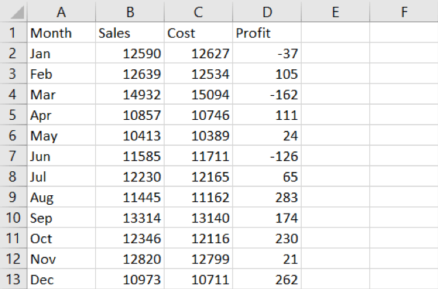
Chart View:
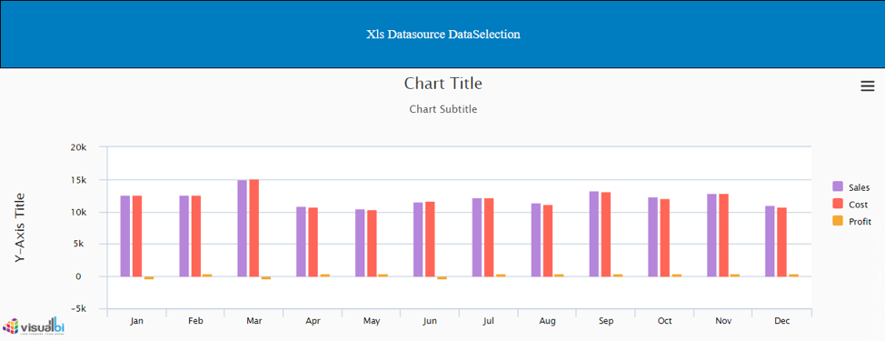
Step2: As observed, there are three key figures mapped against a dimension
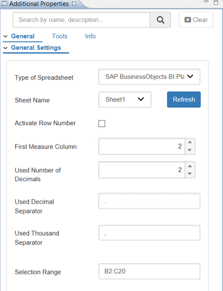
Let’s try to do a data selection that would restrict the chart to two key figures. Data selection option in this feature is based on the row and column numbering in excel. For our requirement we would need the data present between the range B2 to C20. Lets configure the same in the additional properties of the DS_1 as shown below:
Executing step 2 would result in the below visualization:
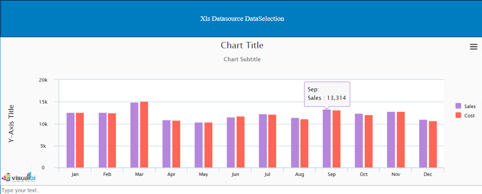
Step 3:
Let’s try another scenario where the restriction is on rows such that the data is limited to the current month and 2 previous months.
Configure the additional properties of DS_1 as shown below:
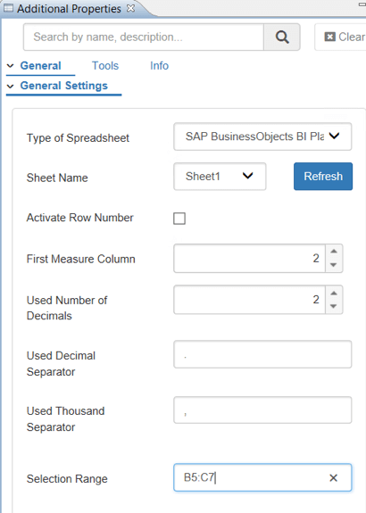
The resulting visualization from the above step is:
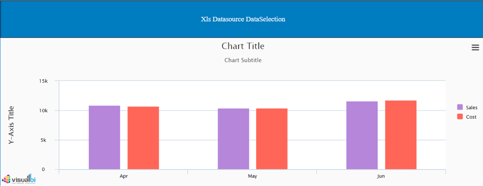
This feature is not only limited to design time. Data selection can be made in run time as well, in which case we will pass the range information dynamically using scripts.
That’s it from this blog, hope this feature helps your use cases for POCs.
