This is part of the Tooltip and Data Label Customization blog series.
In the earlier blog, we looked at tooltip customization using the new tooltip editor. Now let’s look at customizing the data labels using the Data Label Editor Pane.
One of the most common request from customers today is the ability of a tool to show both the actual value and percentage contribution as part of the data labels.
With our latest version of VBX – 2.X we simplified customization of data labels in SAP Lumira Designer by adding the Data Label Editor Pane. The data label editor provides the flexibility not just to choose different formatting options – prefix, suffix, bold, italics, underline, font size and color but also to add additional measures and dimensions present in your data source.
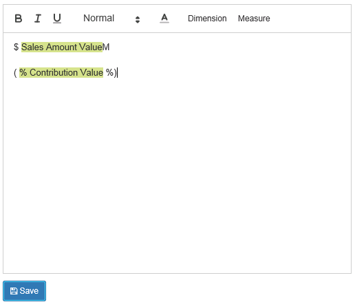

Customizing Data Labels using VBX
Consider the above example of displaying Sales by Product, where you not only want to look at the sales by each of the products but also at the percentage contribution of each product towards the total.
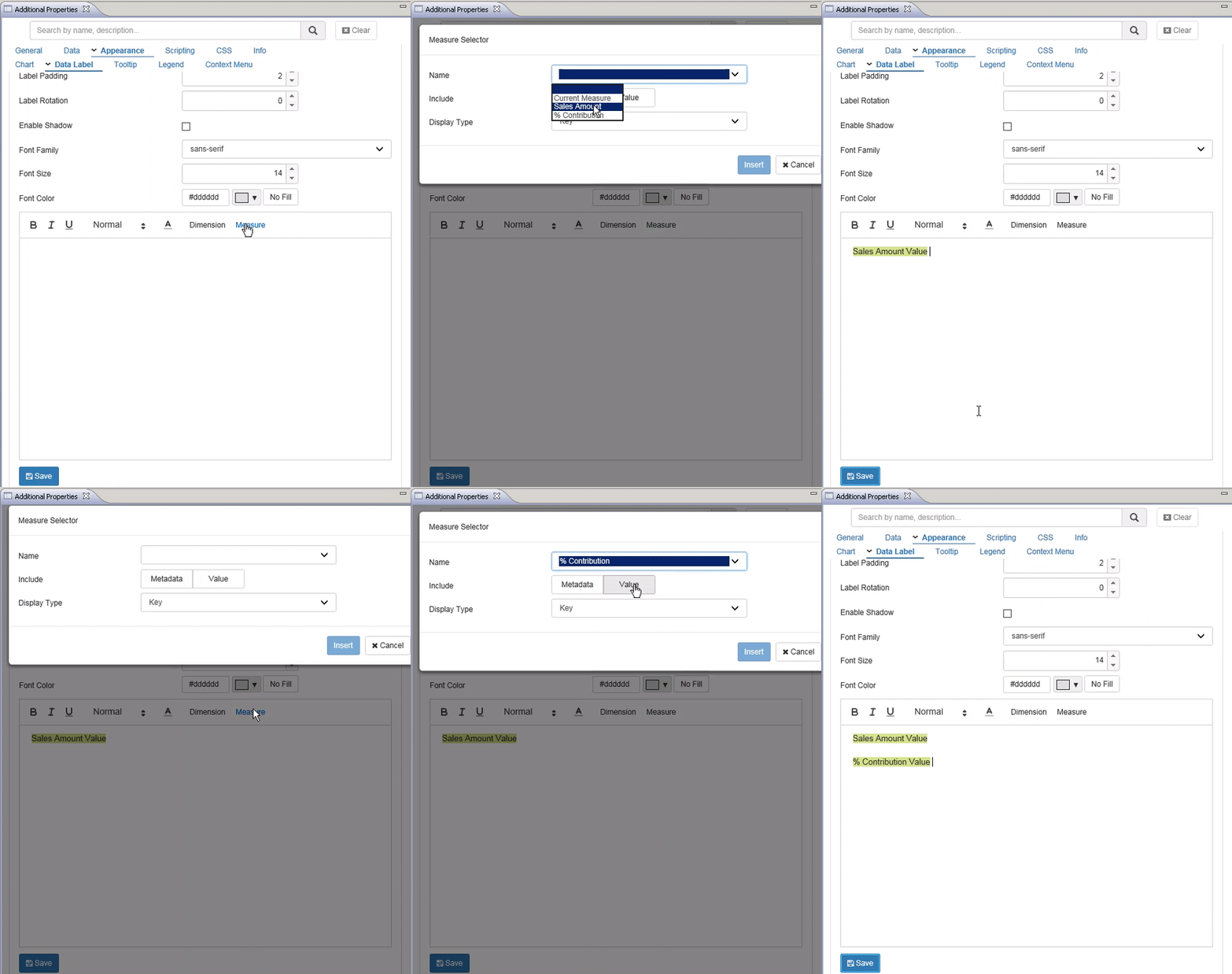
1. Navigate to the Appearance Tab, select Data Label and scroll down to the data label editor
2. Adding Measure – Click on the Measure tab and select the Measures to be displayed from the dropdown along with display type
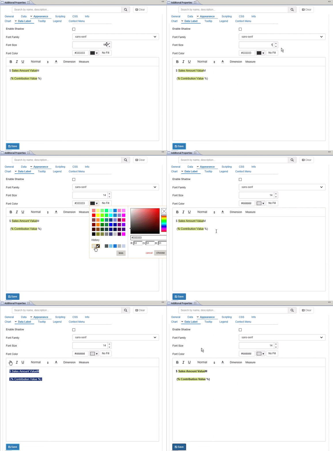
3. The data label editor also provides the flexibility to add text- prefix, suffix or sentences. So, lets add the prefix and suffix to our data labels

If needed you can format the data labels further by changing the font style, size, color, making them bold, italicized or underlined.
Now you see the below chart displaying both actuals and percentage contribution as data labels.
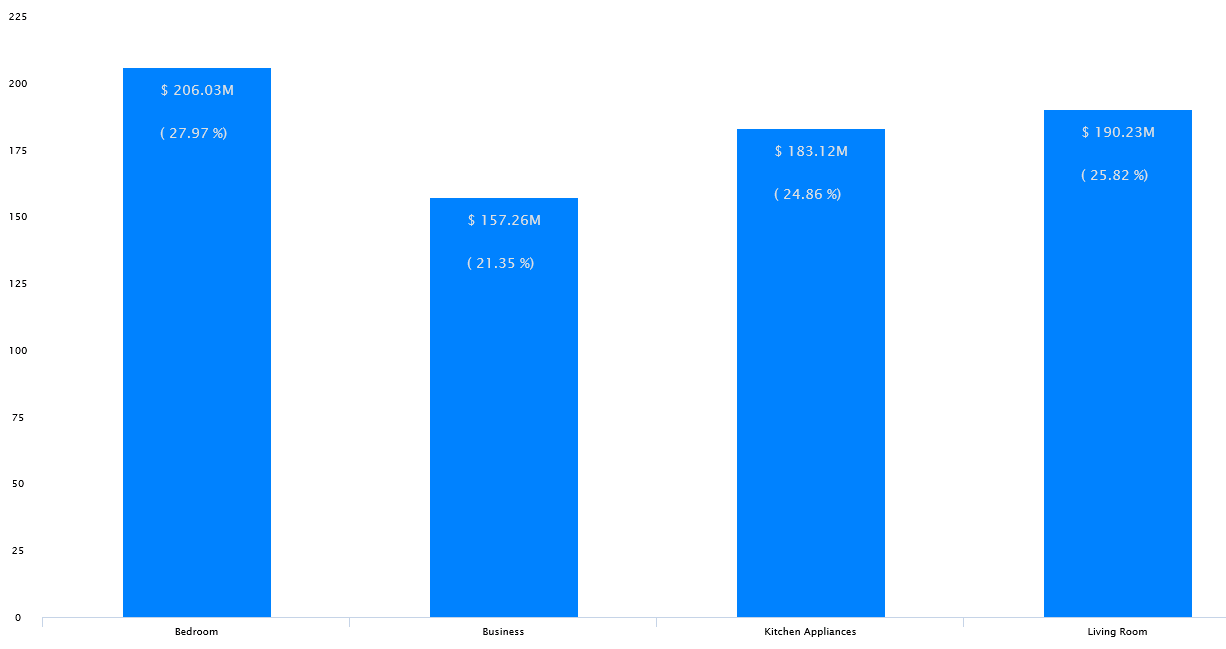
Other examples
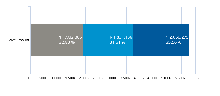
Other example of displaying both actual values and percentage contribution would be in case of stacked charts where we will display the contribution of each of the segments towards the totals along with their actual values ($).
In the next blog, we will be looking at conditional formatting (semantic number formatting) for Data Labels and Tooltip.
So, stay tuned….
