Business users are provided with a lot of data to assist them in the process of decision making. One feature that could add insight to the presented data is the usage of alerts to draw the user’s attention to significant information.
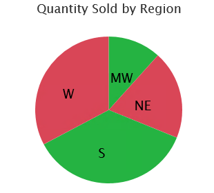
Let us consider a scenario where the user needs to identify whether each region has achieved the target or not. Target defined for each region differs, as regions vary in size and population. We will help the user analyze whether the region has achieved the target or not by formatting the data.
The sales and target details of the regions are available from 2 different data sources. Since the values are available from two different data sources, we cannot compare them using native conditional formatting.
VBX has a set of components which has many additional features compared to the native components. We will make use of one such component to achieve the desired output.
VBX Pie chart, one of the VBX components, provides the advantage of using series color property to format the data based on conditions.
We need to create our own conditions in a Global Script Function and use the function wherever required:
Create separate variables for each region:
var northeast = “”;
var midwest = “”;
var west = “”;
var south = “”;
Now we will assign the respective color to the variable based on the condition it satisfies. Green denotes that the target is achieved, and Red denotes it has not met the target.
Condition for Middle West Region:
Assigning the sales value of Middle West region to the variable mw_sales.
var mw_sales = Convert.stringToFloatUsingLocale(DS_1.getDataAsString("ZR9QTY0000000000000000006", { "ZR_STOKY__ZR_REGKY": "MW" }));
Assigning the target value of Middle West region to the variable mw_sales.
var mw_target = Convert.stringToFloatUsingLocale(DS_2.getDataAsString("ZTRQTY0000000000000000012", { "ZR_TARGT__ZR_REGKY": "MW" }))
Now once we have the sales and target, we need to compare them to identify whether the region has met the target or not.
if(mw_sales > mw_target) { mw = "#25B342"; /* HEX colour for Green */ } else { mw = "#D94657"; /*HEX colour for Red */ }
Similarly, we can define the rules for other 3 regions. Now, all the 4 variables have colours assigned to it based on the condition it has satisfied.
Now, we will assign these colours to the respective members on the pie chart with the help of OnDemandScript api.
What is OnDemandScript api?
This allows us to modify certain properties of the chart that are not available through api’s.
PIECHART_1.DSXSetOnDemandScript("measurecolorpair", '{"W":{"color":"'+w+'"},"S":{"color":"'+s+'"},"NE":{"color":"'+ne+'"},"MW":{"color":"'+mw+'"}}');
Parameters of the above function are:
- Property Name: measurecolorpair
- Dimension member: W, S, NE, MW
- Style Property: color
- Local Variable: w, s, ne, mw

Once the conditions have been defined, we can invoke this Global Script Function whenever the result set gets changed.
This helps us easily identify that the regions West and North East have not achieved their targets.
