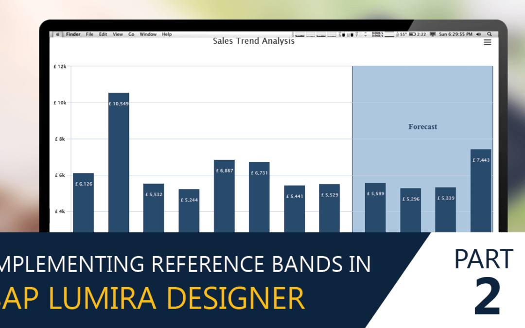
In the earlier blog we looked at Implementing Reference Bands having fixed limits in SAP Lumira Designer
Now let’s look at creating Reference bands for Variable Limits.
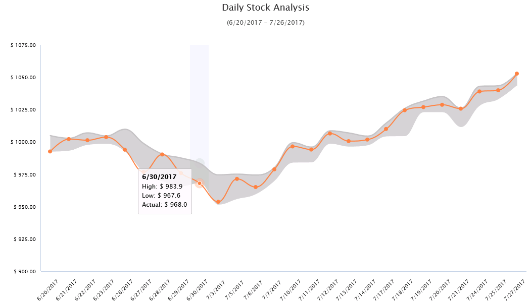
Implementing Variable Limits Reference Band in a chart
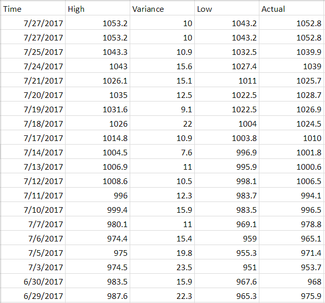
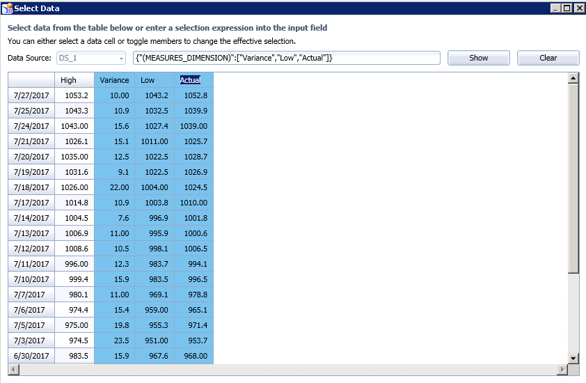
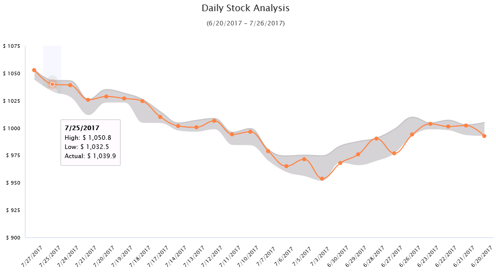
Sample Data
Consider the following sample data, which lists Amazon Stock value for last 1 month – High, Low, Actual and the variance (difference between the highs and the lows)
To create a variable plot band, we would be using the VBX Dual Axis chart as it gives us the flexible to choose the data series type. (Area, Line, Stacked charts……)
Step 1: Drag the VBX Dual Axis chart and select the required data for the chart in the chart properties.
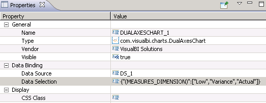
Click on Data Selection and select the following Measure columns – Variance, Low, Actual.
Please note: The order of the measures is important to configure this use case.
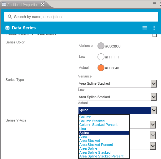
Step 2: Navigate to the additional property sheet and select Data Series Tab
- Set the series colors for each of the measures (Variance = light grey, Low = white and Actual = orange)
- Set the Series Type for each of the measures:
- Variance = Area Spline Stacked
- Low = Area Spline Stacked
- Actual = Spline
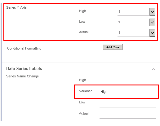
Step 3: Configure the other series properties
- Set the Series Y axis as 1 for all the measures
- Rename the Variance measure as ‘High’. This would be handy to configure the tooltip information later.
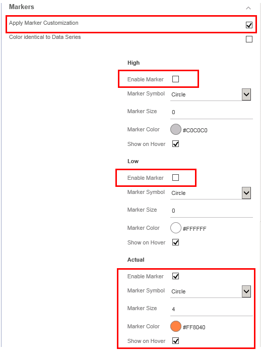
Step 4: Configure the marker properties
- Enable the Apply Marker Customization property by checking it
- Disable the Markers for both measures – High and Low
- Enable the Marker for Actual Measure
- Set the color and size of the marker (Color = Orange and Size = 4 as seen below)
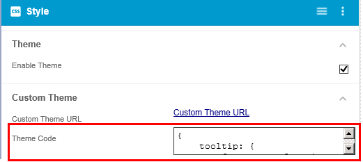
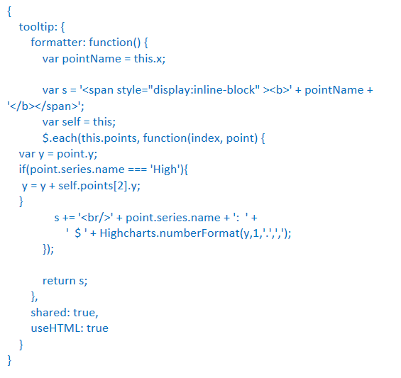
Step 5: Navigate to the CSS tab and paste the following piece of code in Theme code box. Don’t forget to enable the Custom Theme property
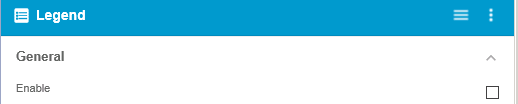
Step 6: Navigate to the legends tab and disable the legends
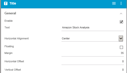
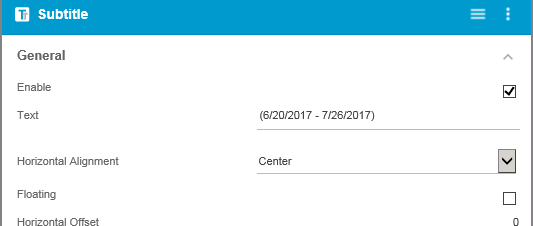
Step 7: Navigate to the Title and Subtitle Tab and set the following properties:
- Title / Subtitle Text
- Horizontal Alignment (center as seen below)
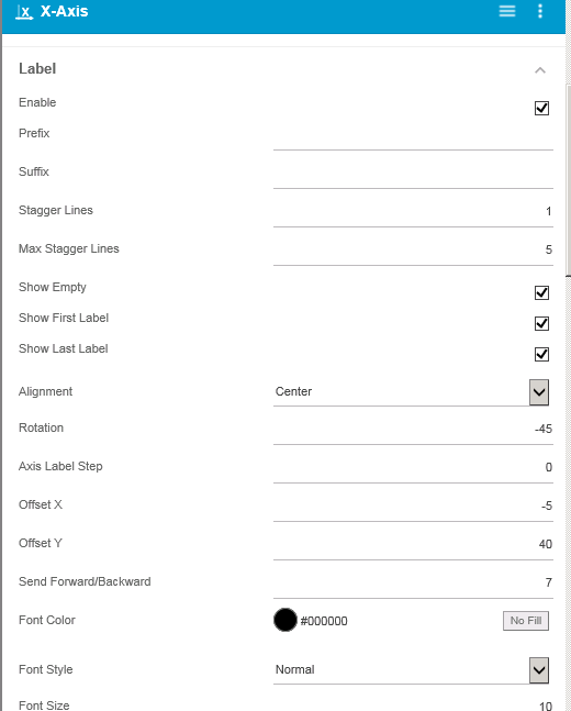
Step 8: Lastly Set the X axis property as follows:
- Label rotation (-45 in the example below)
- If needed, X and Y offset for better label alignment
Finally, we have a variable reference line displaying stock information.
Additional useful references,
Importance of Reference lines and Bands
Implementing Reference Lines in SAP Lumira Designer
Click here to download a FREE 15-day trial of VBX for SAP BusinessObjects Design Studio/SAP Lumira Designer.