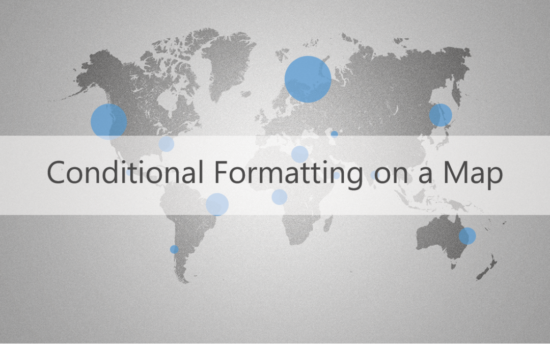
This is part of the VBX Geo Mapping Capabilities blog series.
Conditional Formatting is an interesting feature. It’s flexible and is a great way to easily visualize data within a range that meets some criteria. Maps, on the other hand, is a data visualization element that enables users to receive vast amounts of geographical information and efficiently interpret data. Combining these two features will create a good analysis platform for BI users to gauge business performance as good or bad.
What if you want to show the performance of a Sales office, the performance of a Plant, or any other geo related data with conditional formatting? Here’s how-
As you know, Maps could be the most appropriate component to analyze geographical data. We can, of course, show the same in other visuals with conditional formatting but,
- using a table is complex to understand
- using charts makes it difficult to link locations.
So using a map for analyzing geographical data is a lot more sensible than analyzing the same in a chart or a table, and it provides clear analysis if conditional formatting is involved.
The key to achieving it? VBX’s Location Analyzer.
VBX’s Location Analyzer component helps us achieve conditional formatting in a simple way. This component avoids major work-around at data and designing level, and can be achieved easily with a single data source. This will make us understand the situation at a glance and in a subtle manner. Within seconds, we can understand which region is performing well, and provides a clear picture of whether underperformance is from a single location, a portion of the region, or the entire region. Upon this inference, we can proceed with further analysis.
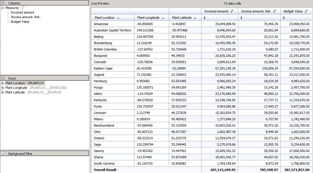
Here’s an example- to show the performance of a Plant in the Location Analyzer. By using conditional formatting, we are going to show which plants have spent more than its financial plan and which plants have spent well within budget.
For this, I’ve used a data source with the following dimensions and measures-
Dimensions:
- Plant
- Latitude of Plant Location
- Longitude of Plant Location
Measures:
- Invoice Amount
- Invoice Amount Returned
- Budget
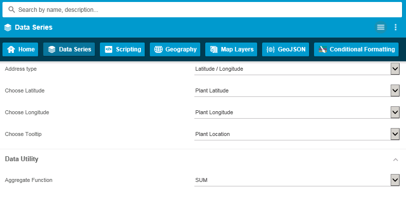
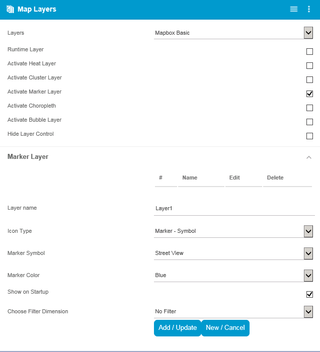
For plotting the plant locations in the map, configure the location properties in Location Analyzer under ‘Data Series’ tab in the Additional Property sheet.
Before we create a condition, we need a base to do conditional formatting. The base can be any one of the map layers. Map layers are nothing but the different ways of representation available in this component. Here, I choose ‘Marker Layer’ as the base layer.
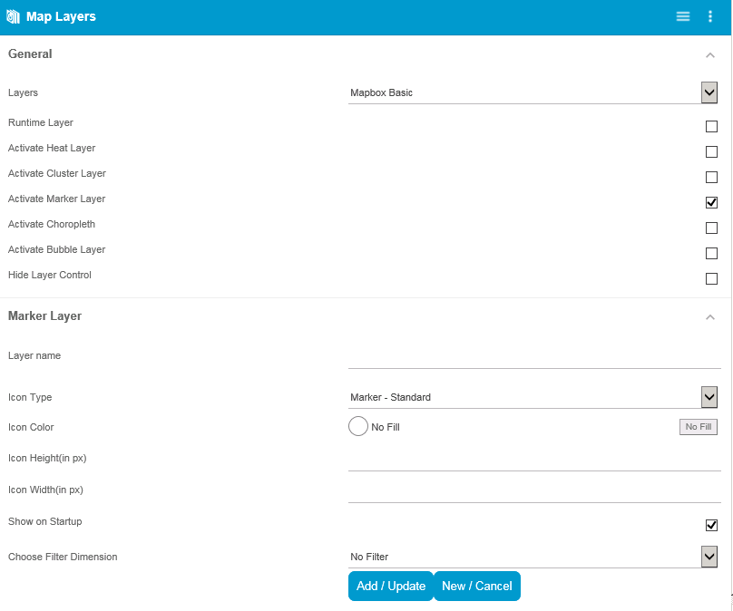
Adding a new Marker Layer by choosing the option ‘Activate Marker Layer’ makes it the base layer for conditional formatting. Provide the name, icon, and size as required.
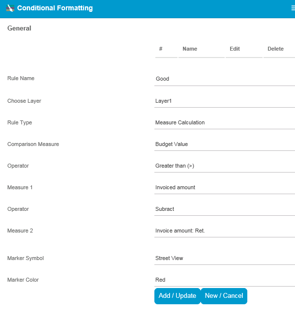
Now for the main picture- Add a new rule under conditional formatting tab. According to our scenario, the rules are:
- Spend (Invoice amount – Invoice amount returns) > Budget – Red color
- Spend <= Budget – Green color
Here, Spend value is based on a calculation. There is no need to create a new measure with this calculation. Basic arithmetic operation can be performed within the rules. We can have as many conditions as required.

You can change the symbol and the color of the points as per the requirement in the rules.
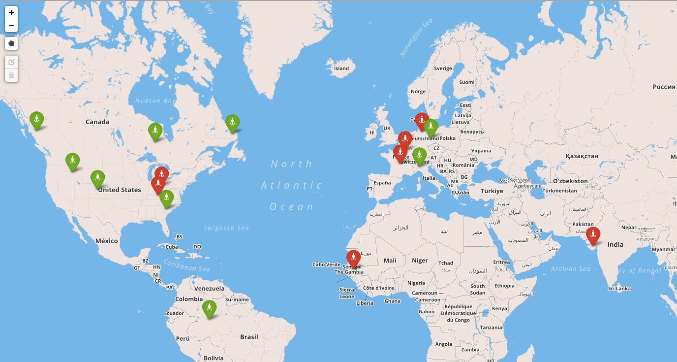
If you have followed the steps, you will arrive at a map like the one above.
Conditional Formatting can also be used for visualizing several other scenarios and in different perspectives. Some of the ways could be:
- Categories whose spend is within the budget
- Identification of who is ahead of target
- Knowing the level of performance – good, bad, or average
- Differentiating the points by ‘Product’, by type of Distribution Channel, or by Profit Center with the help of different symbols or colors
- On-the-fly calculation and comparison
- Slicing based on defined threshold
- Comparing various countries’ revenue with a particular country’s revenue
- Create different rules on different layers, activate the layer that you want at runtime, and perform better analysis
- Comparing the performance with previous period
Combining Conditional Formatting and Map will give you an excellent visual inference and better analysis, at a glance, for geo related information. There are similar features in VBX for SAP Design Studio.
For more information on conditional formatting for charts please refer the following blog – Dynamic conditional formatting in SAP Lumira Designer.