For latest enhancements on the KPI Tile, please refer to our recent blog- 10 Features To Enhance Your KPI Tiles
In addition to the two previously discussed components – Hierarchical Filter and Advanced Table – we have also added a new KPI Tile as part of our recent release of the VBX for SAP BusinessObjects Design Studio.
The new KPI Tile component allows you to quickly show a single measure as the main “visual aspect” of the component, but you can also add several other options as well.
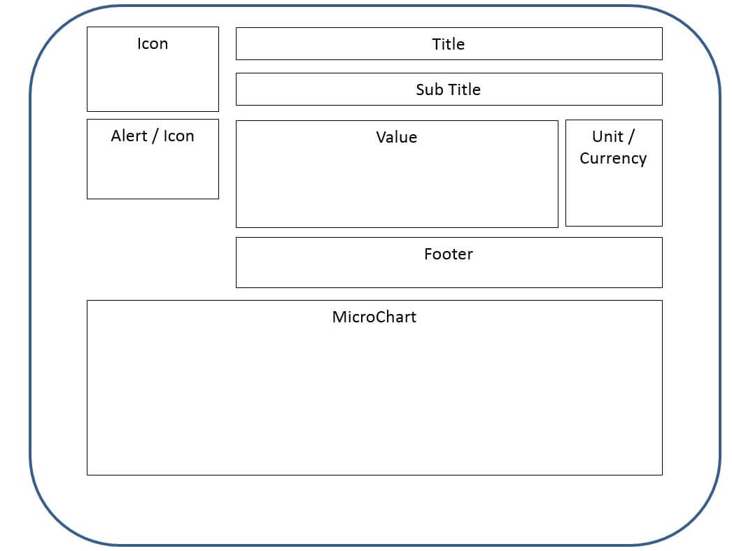
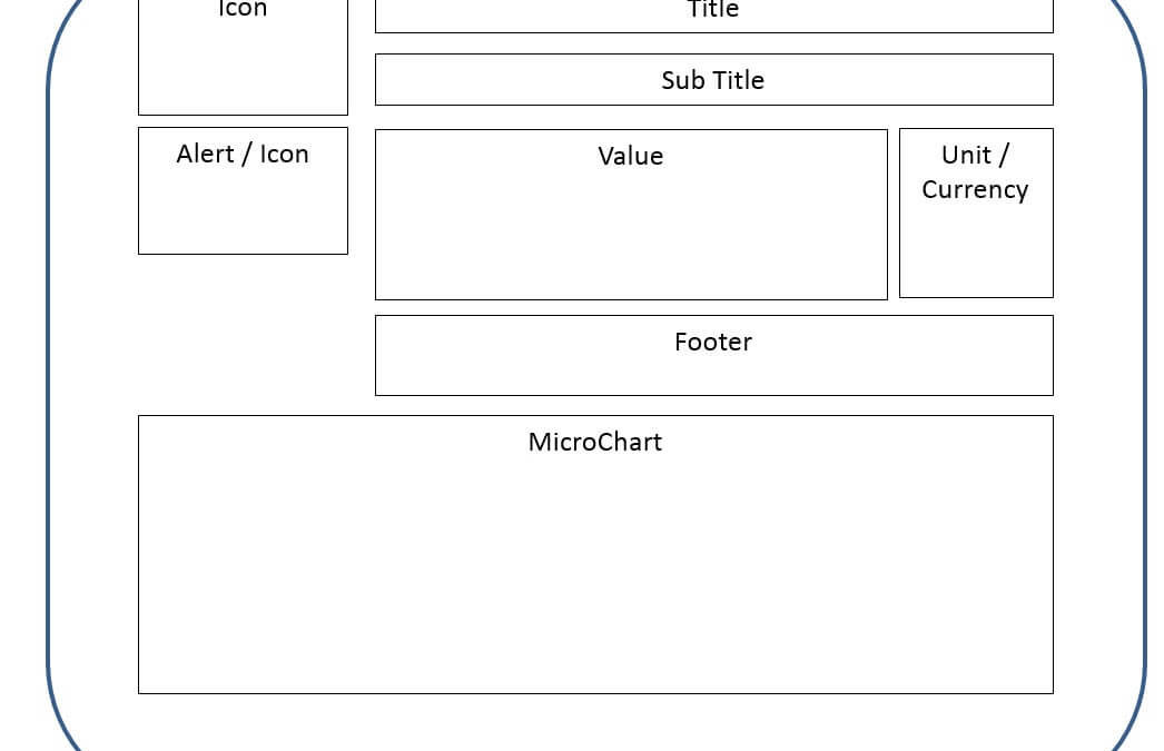
Figure 1 shows the new KPI Tile as a conceptual display. Our KPI tile supports the display of
- …a single KPI value
- ….the Unit / Currency
- … a title and sub title
- …a icon to provide the user a visual clue
- … an alert symbol based on a defined threshold
- … a footer
- …a micro-chart / sparkline chart showing the trend
All the items are optional and it is up to you to decide which of those elements will be part of your KPI tile and where these elements from a layout perspective are going to be displayed.
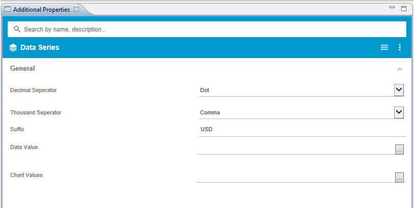
In the Data Series category of the Additional Properties, you can select the value using the Data Selection feature for the property Data Value and you can define the data selection for the chart.
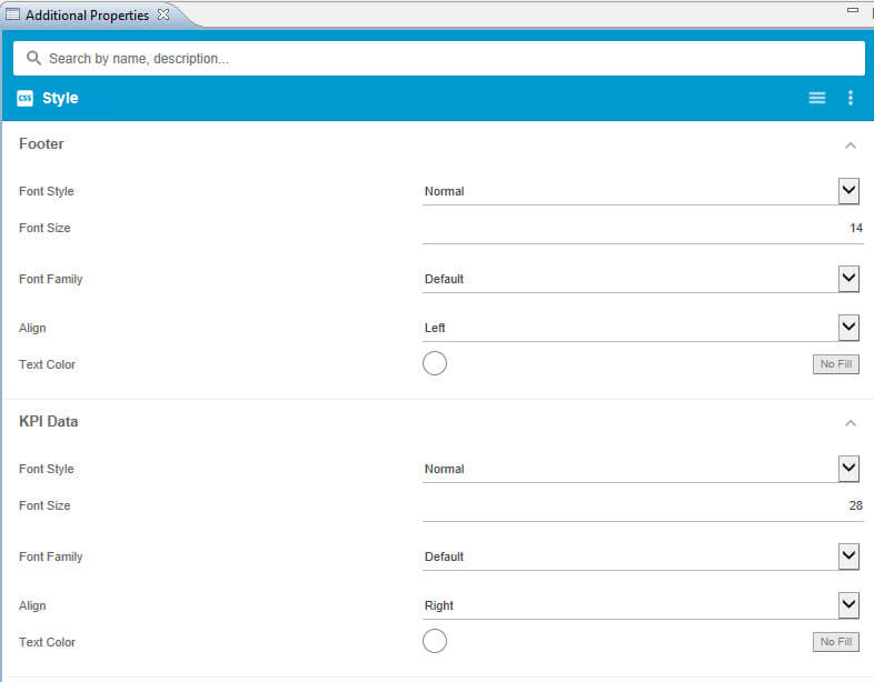
With the huge set of style options (Figure 3 shows only a subset), you can then customize the look and feel of your KPI tile.
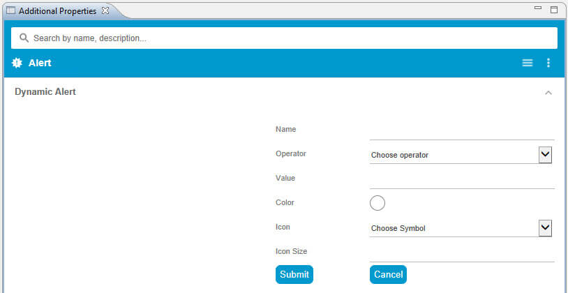
And with the Alert category (see Figure 4), you have the ability to define a formatting rule for the Alert Icon. The entered value will be compared against the value you selected for the KPI tile itself.
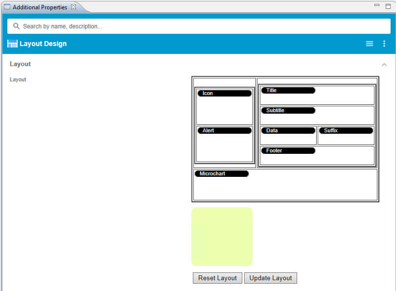
And finally the category Layout Design allows you to define the layout of your KPI Tile.
Figure 5 shows an example with all elements added to the KPI Tile, but that is optional. The Layout Design also allows you to place the elements into different areas or to remove them and to only use a subset of the available elements as part of your KPI Tile.
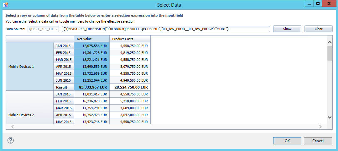
So let us now build our first KPI Tile. Our data set shows the Revenue and Product costs based on our Product Category for the first 6 months of the year 2015 (see Figure 6).
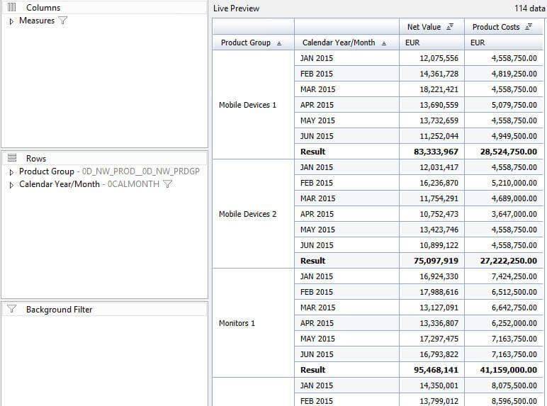
We are going to use the subtotal for the Product Group “Mobile Devices 1” as the KPI value and we will use the 6 months as values for the Sparkline chart.
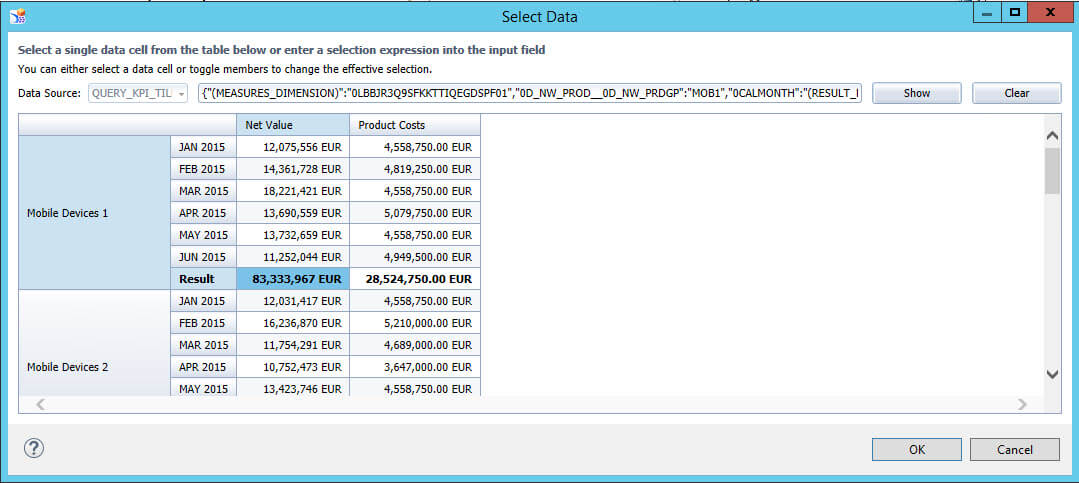
In the Data Series category, we are using the data selection feature to choose the value for the main KPI value (see Figure 7) and we are also using the data selection feature to specify the data for the chart (see Figure 8).
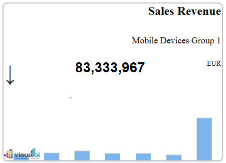
In addition, we are adding the title and subtitle, the currency, and doing some minor formatting, such as changing the font style and font sizes and our KPI Tile looks like this (see Figure 9) so far:
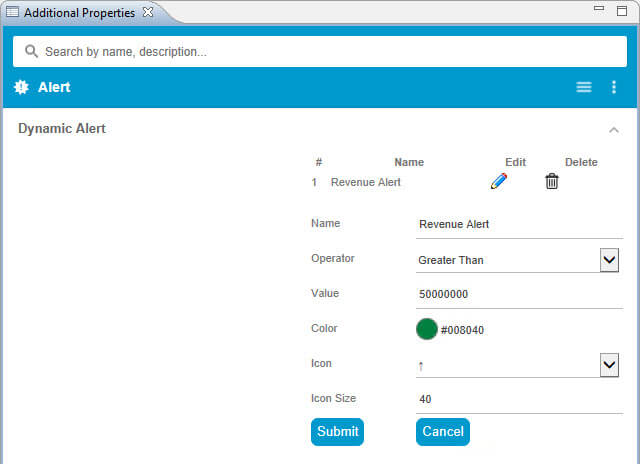
At this point, we are missing a formatting rule for our alert and we are missing an image which will provide our users a visual clue on the product group.
In the Alert category, I am first of all adding a rule as shown in Figure 10.
In addition, we are adding an Icon URL to our KPI so that we are giving our user a visual indication about the product itself and we then have a KPI Tile that looks similar to what is shown below.
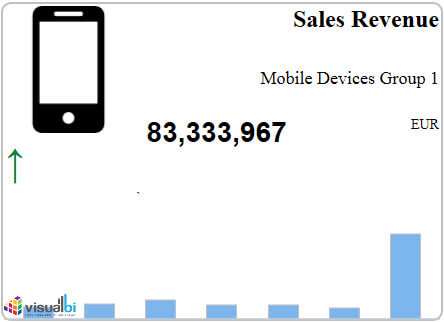
In a few steps we were able to display a KPI in combination with an alert, a trend in form of a sparkline chart, and all together the content is being displayed in form of a KPI Tile.
In case you would like to try this with your own data, register for our 30 day trial.