Column and Bar charts are the undoubtedly one of the most effective and commonly used charts, but certain variations of the same make the dashboards look more informative. One such variation is the Lollipop chart. The lollipop chart is a variation of the Dot plot where the vertical line stretches only till the dots. Unlike the dot plot the lollipop chart is used to display only one dot per line.
This doesn’t mean that the Lollipop chart is better than Bar/Column chart but there are certain use cases where a Lollipop chart would be a better visual representation, which are:
- While viewing substantial amount of data(bars), Lollipop charts looks less busy than a bar/ column chart and hence becomes easier to infer.
- It provides a much cleaner look by using lesser ink and has a ‘lower data ink ratio’
Implementing Lollipop Chart using VBX
Sample Data
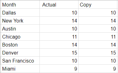
For our lollipop chart use case, we need 2 measures – one for showing the actual revenue and the other which is the copy of the same, for displaying the dot
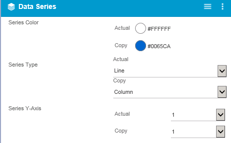
Step 1: Drag the VBX Dual Axis chart and navigate to Data Series Tab in the additional property sheet
- Set the series colors for each of the measures (Actual = White, Copy = Blue)
- Set the Series Type for both the measures (Actual = Line and Copy = Column)
- Set the Series Y axis as 1 for both the measures
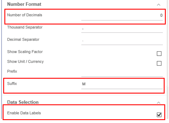
Step 2: Scroll down to configure the data label properties
- Set the number of decimals to 0
- Enable the data labels by checking it
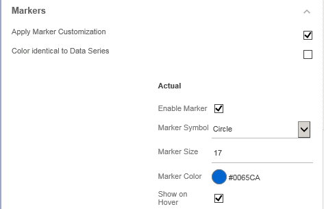
Step 3: Configure the marker properties
- Enable the Apply Marker Customization property by checking it
- Disable the property – Color identical to Data series
- Enable the Marker for the Measure – Actual
- Set the marker symbol to circle (you could choose a different shape if you would like)
- Set the color and size of the marker (Color = Blue and Size = 17 as seen below)
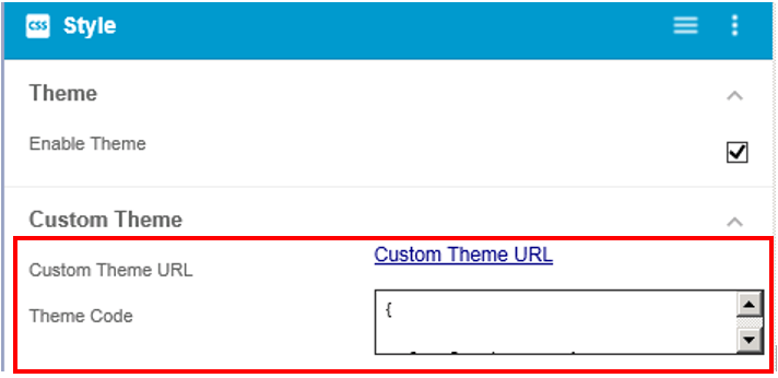
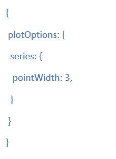
Step 4: Navigate to the CSS tab and set the custom theme
- Paste the following piece of code in Theme code box and enable the Custom Theme property
Step 5: Navigate to the Title Tab and set the following properties:
- Title Text
- Horizontal Alignment (center as seen below)
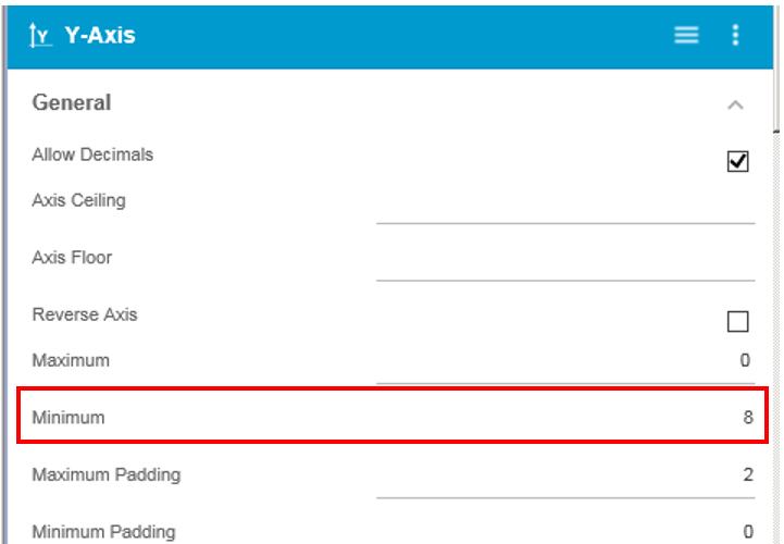
Step 6: Lastly, if needed you could scale the Y axis and provide a minimum axis point
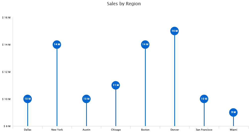
Finally, we have a Lollipop chart displaying Sales information by Region

Looking to create your own Lollipop chart in SAP lumira Designer?
Click here to download a FREE 15-day trial of VBX for SAP Lumira Designer(VBX)