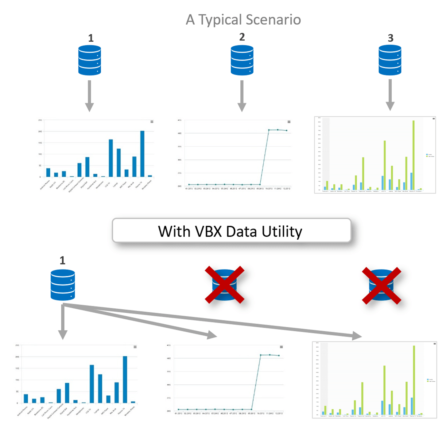
One of the most effective ways of improving your SAP Lumira Designer application’s performance is by limiting the number of data sources. This can be achieved by reusing data sources across multiple components, this way multiple charts can reuse the same data source instead of connecting each of them to a independent data source.
Using the native SAP Lumira Designer charts, you can reuse data sources for multiple components only to an extent as you can select the required measure and not the corresponding dimension for the chart. For instance, you cannot have 2 charts that use different dimensions from the same data source.
VBX provide a unique property known as ‘Data utility’ which addresses this gap and helps you reuse the data sources by pivoting the data as required by the specific charts – with the ability to select the required dimension and measure.

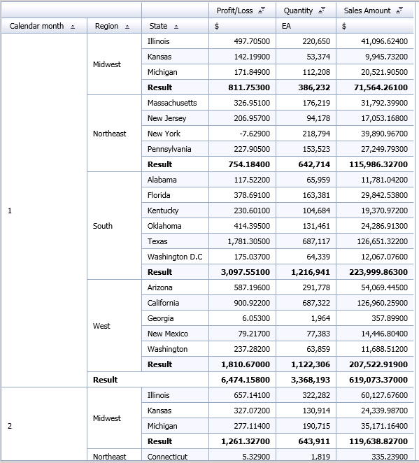
Consider the following data source having Dimensions (Region, State and Months) and Measures (Profit/Loss, Quantity and Sales Amount) which you want to reuse amongst multiple charts, such that each chart will display different information.
Data Source:

Visualization needs:
Chart 1 – Sales by State
Chart 2 – Profit by Region
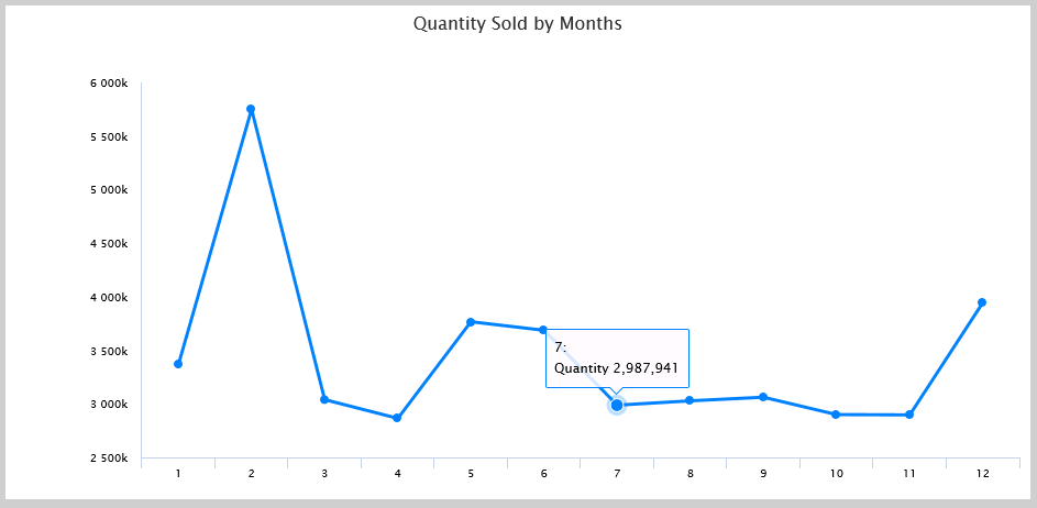
Chart 3 – Quantity sold Trend Analysis
Using Native SAP Lumira Designer Charts
As seen from the following image, native charts only support measure selection and not dimensions. Hence, all the dimensions (Region, State and Product Category) present in the data source are displayed – which is not the desired outcome.

Using VBX charts – Data Utility
With the help of the ‘Data utility’ property you can quickly select the preferred dimensions & measures and create different views for the chart using the same data source.
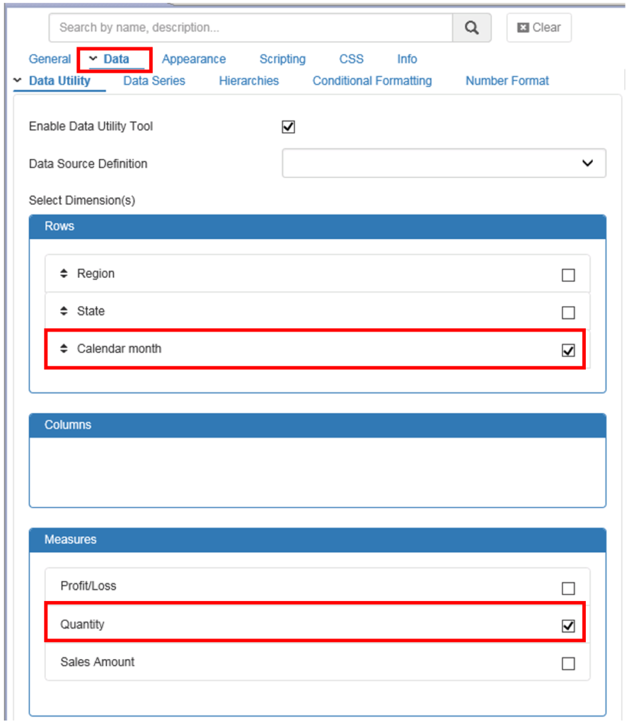
Following are the steps to create the above chart using Data Utility:
- Connect the data source to the chart and navigate to the Data Tab
- Enable Data Utility by checking the Enable Data Utility tool checkbox
- Select the Dimensions and Measures needed for the chart.

Our chart is ready – Quantity Sold Trend Analysis, where we have the Month as the dimension and Quantity as the measure while still using the same data source.

By following the above steps, you can reuse the same query and/or choose different combinations of the available Dimensions and Measures required for your charts
Click here to download a FREE 15-day trial of VBX for SAP Lumira Designer
