
Column charts might not be the ideal use case for all scenarios, especially when you have values that are very close to each other, it becomes very hard to visualize the difference between the columns. Another option and a compelling visual for the same would be a Dumbbell chart.
The Dumbbell chart, also referred to as a Barbell or DNA chart, is a variation of a dot plot where in, the 2 dots are connected by a line, signifying the change between the 2 data points for each of the dimensions. As compared to regular bar or column chart the dumbbell chart is relatively more visually appealing and effective for certain scenarios. They also look much cleaner since they require lesser ink and real estate on the dashboard.
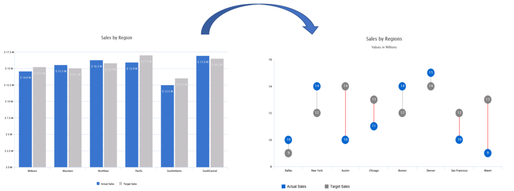
Let’s look at building a simple dumbbell chart using the VBX Dual Axis chart.
Implementing Dumbbell Chart (aka DNA or Barbell chart) using VBX
Sample Data

For a dumbbell chart, we need 4 measures:
- 2 measures for the dot pot: Actual and Target (as seen from the data above)
- 2 measures for displaying the line connecting the 2 dots: Mod (Modulus of variance) and Resultant (displaying the min value between Actual and Target)
Step 1: Drag the VBX Dual Axis chart to the canvas and click on Data Selection to select the following Measure columns – Mod, Resultant, Actual and Target.
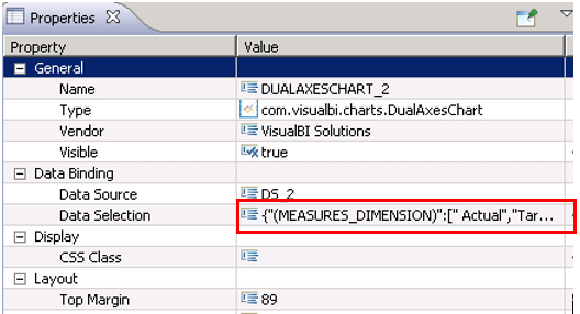
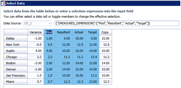
Please note, that the order of the measures is important to configure this type of chart.
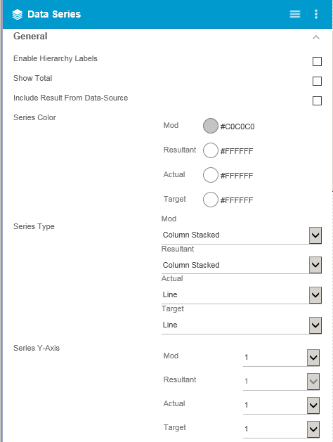
Step 2: Navigate to the additional property sheet and select Data Series Tab
- Set the series colors for each of the measures (Actual, Target and Resultant = White, Mod = Grey)
- Set the Series Type for each of the measures
- Mod = Column stacked
- Resultant = Column Stacked
- Target = Line
- Actual = Line
- Set the Series Y axis as 1 for all the measures
Step 3: Scroll down to configure the data label properties
- Set the number of decimals to 0
- Enable the data labels by checking it
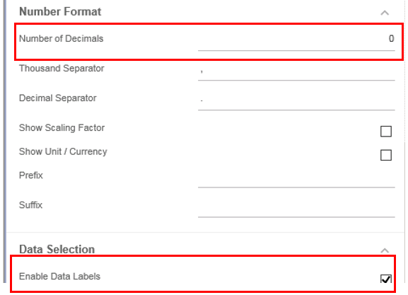
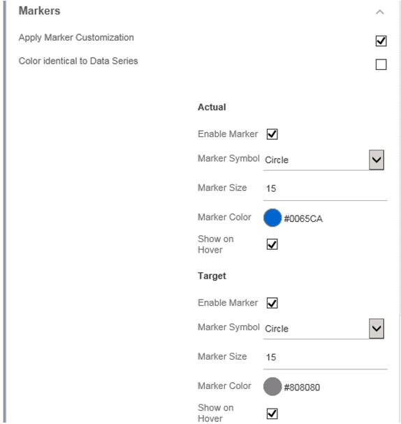
Step 4: Configure the marker properties
- Enable the Apply Marker Customization property by checking it
- Disable the property – Color identical to Data series as we want to display the markers (dot plot)
- Enable the Marker for Actual Measure
- Set the marker symbol to circle (you could choose a different shape if you would like)
- Set the color and size of the marker (Color = Blue and Size = 15 as seen below)
- Repeat the same steps for Target measure and set the marker color to grey
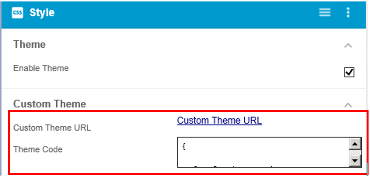
Step 5: Navigate to the CSS tab and set the custom theme
- Paste the following piece of code in Theme code box and enable the Custom Theme property

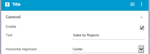
Step 6: Navigate to the Title and Sub Title Tab and set the following properties:
- Title/ Sub Title Text
- Horizontal Alignment (center as seen below)
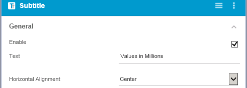
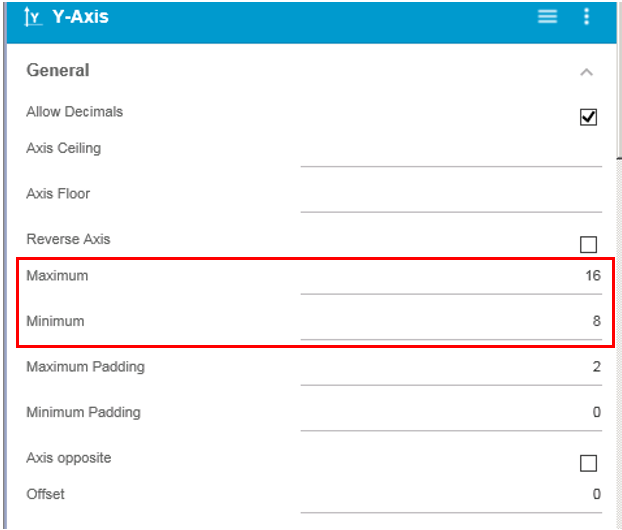
Step 7: Lastly Set the Y axis property as follows:
- Set the max and min value of the axis to display the differences more clearly
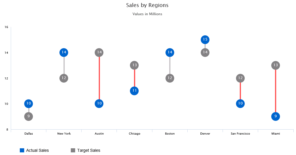
Finally, we have a Dumbbell chart displaying Sales information by Region
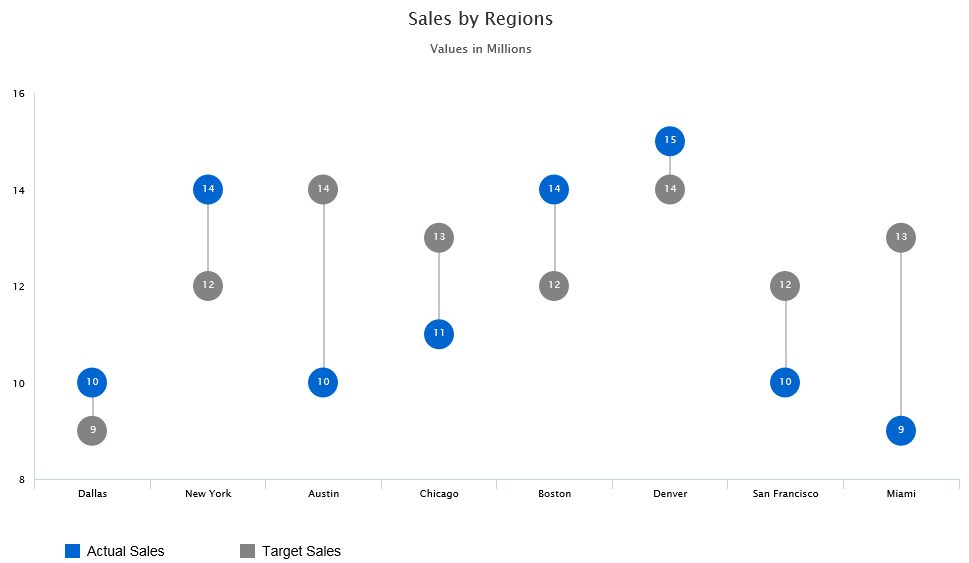
You could also make the chart look more informative and intuitive by conditionally formatting the lines. This way you could easily spot out the regions which need attention (regions where Target > Actual)
Under the data series tab set the conditional formatting rule as seen in the image below.
Here our “Highlighted Measure” is Mod – which can be any of the measures in the data source and our Comparison Measure is Variance – which can be any of the measures in the data source.
For other use cases for conditional formatting refer: Dynamic Conditional formatting in SAP Lumira Designer
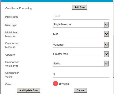
Your VBX Dumbbell chart with conditional formatting is ready!
Looking to create your own Dumbbell chart?
Click here to download a FREE 15-day trial of VBX for SAP Lumira Designer.
